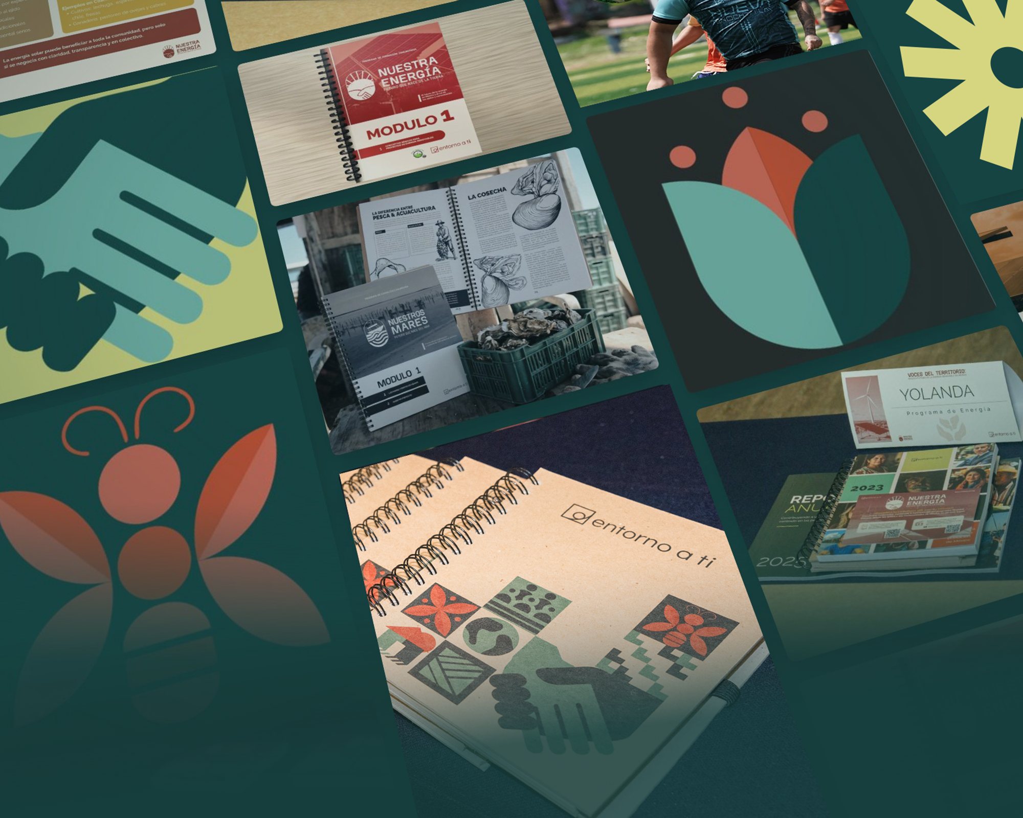
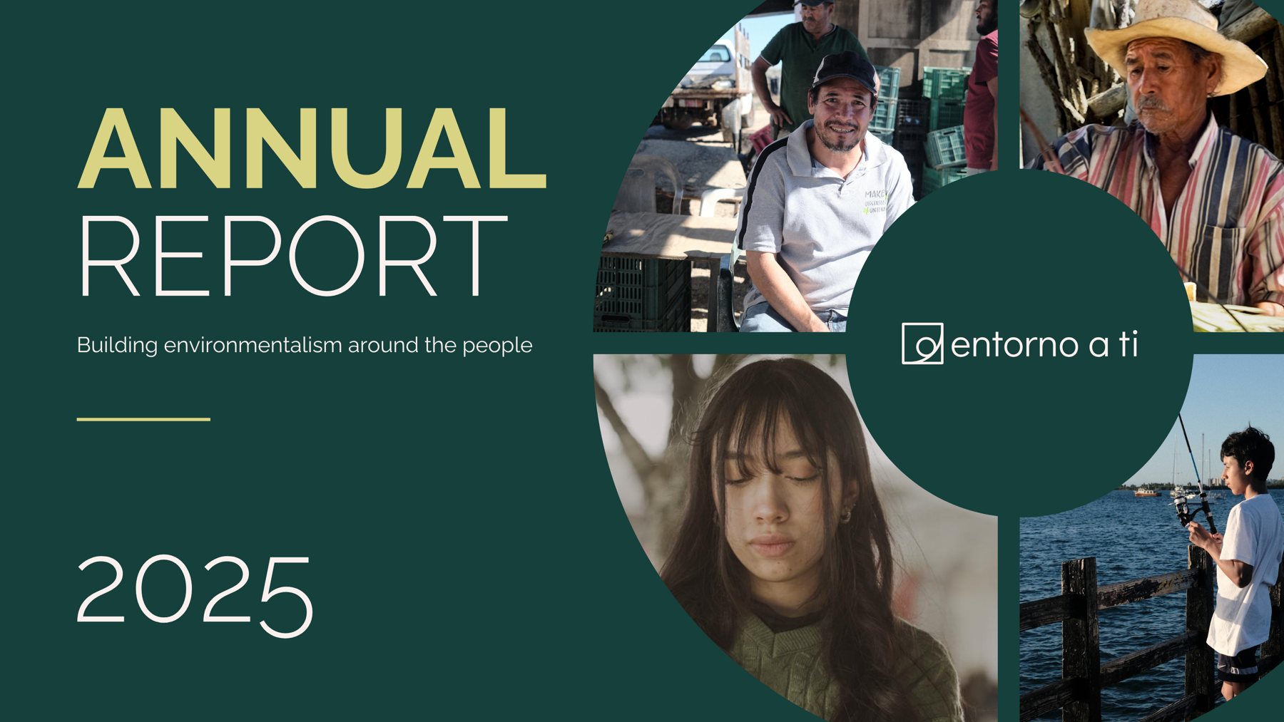
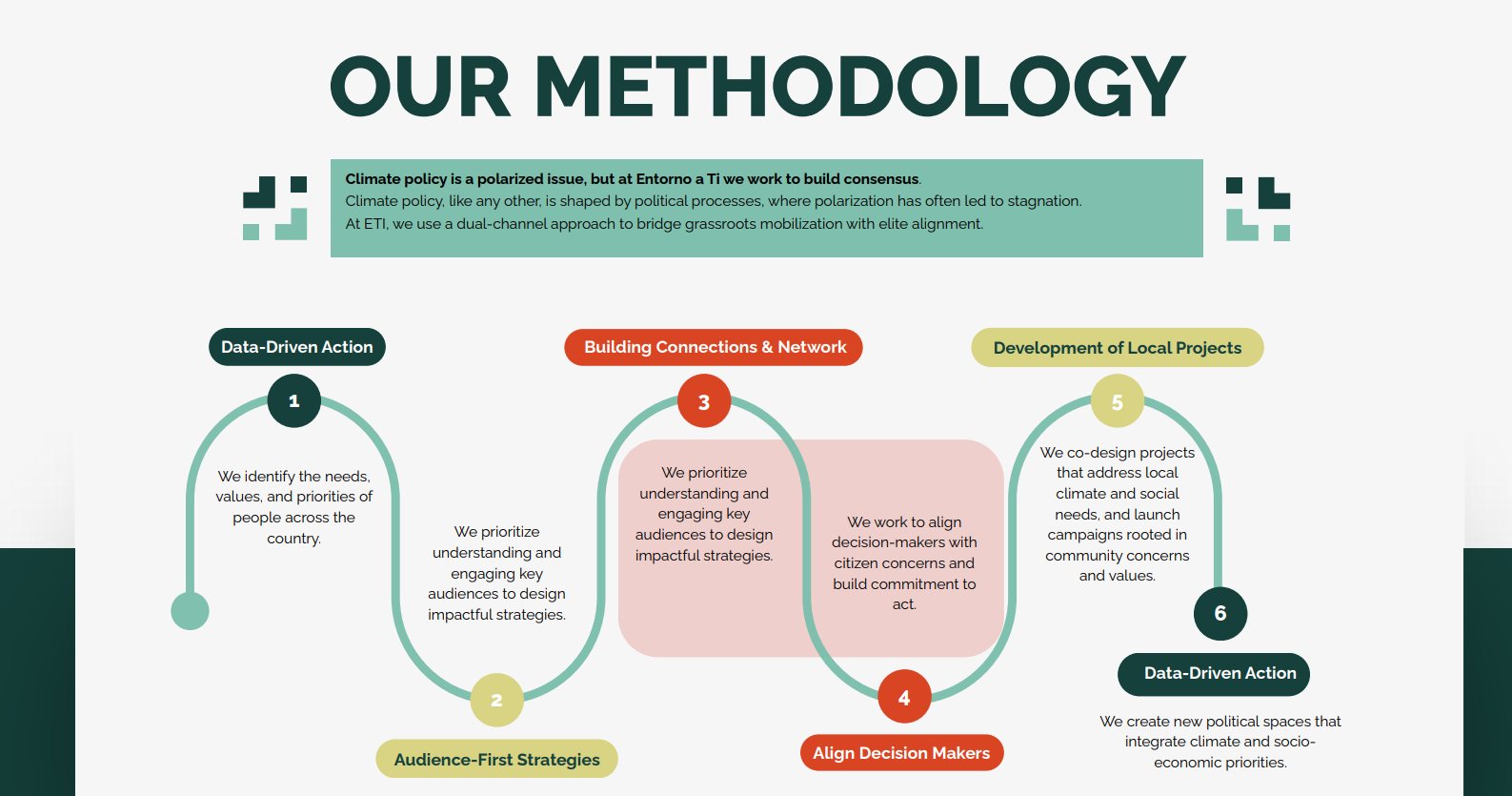
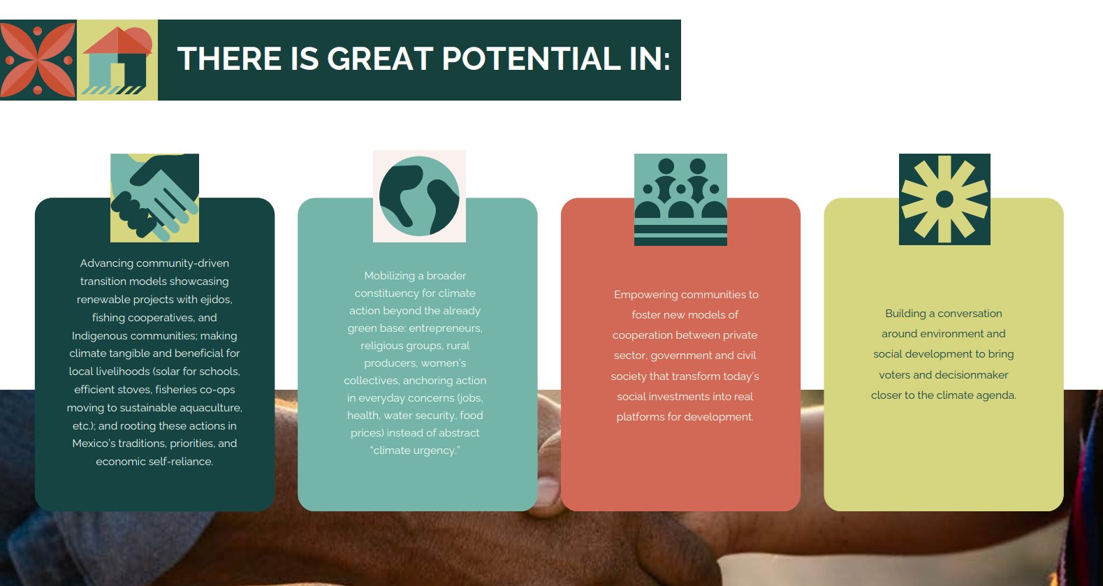
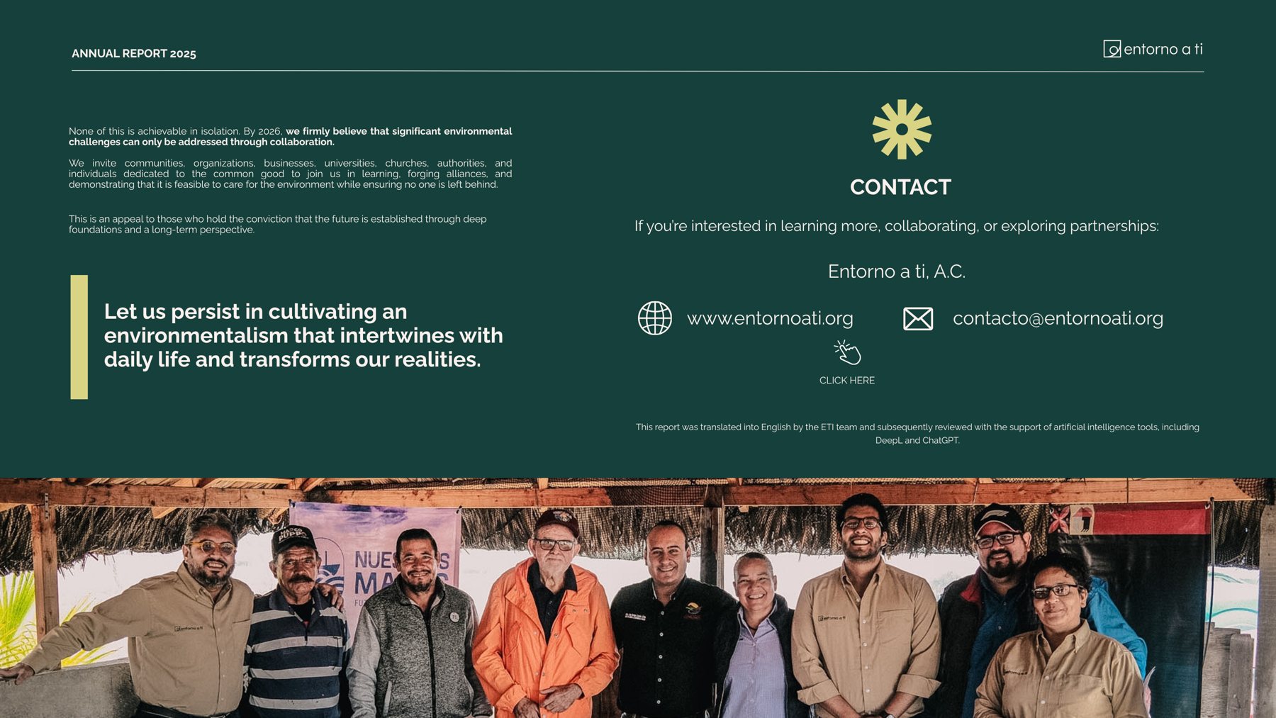
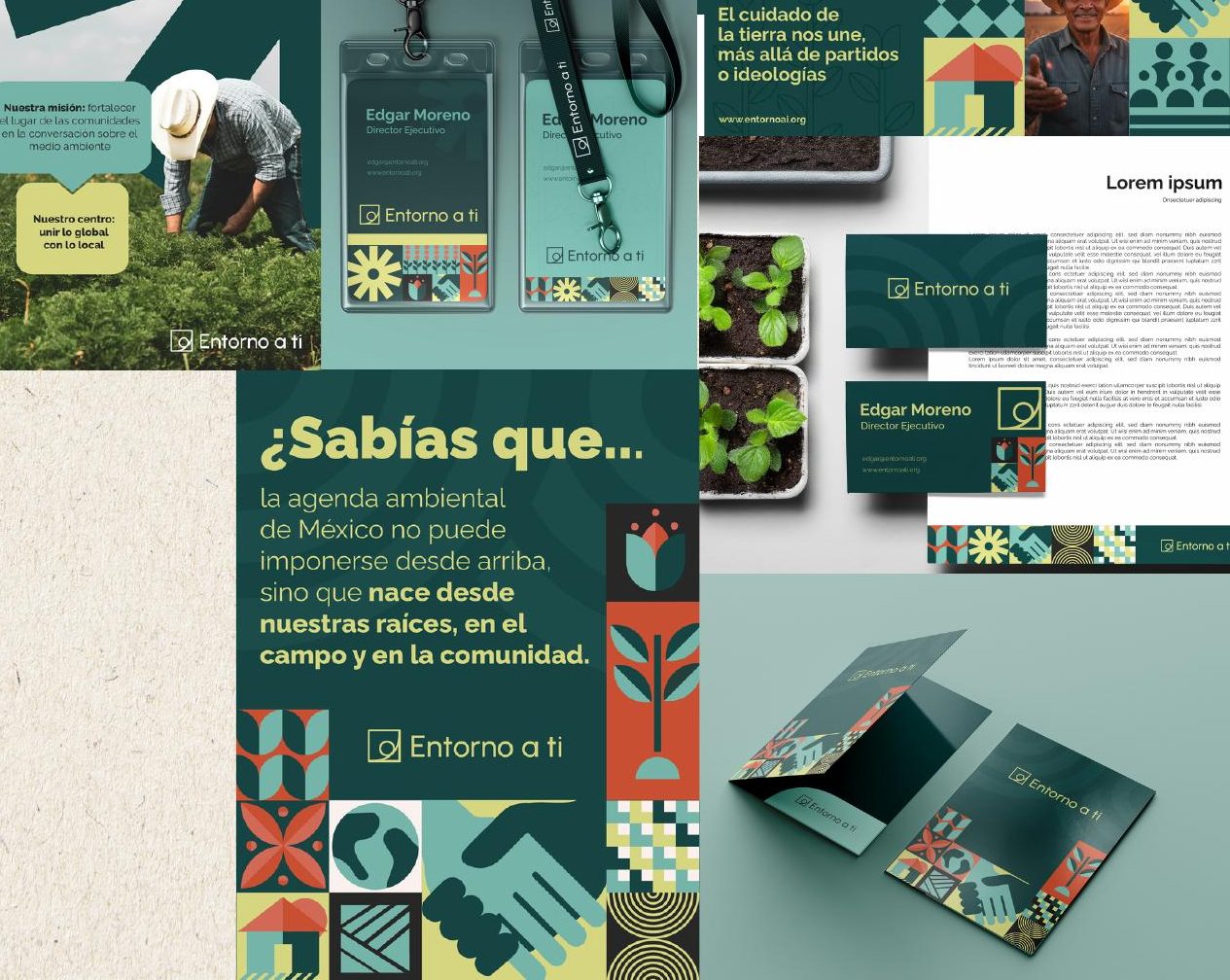
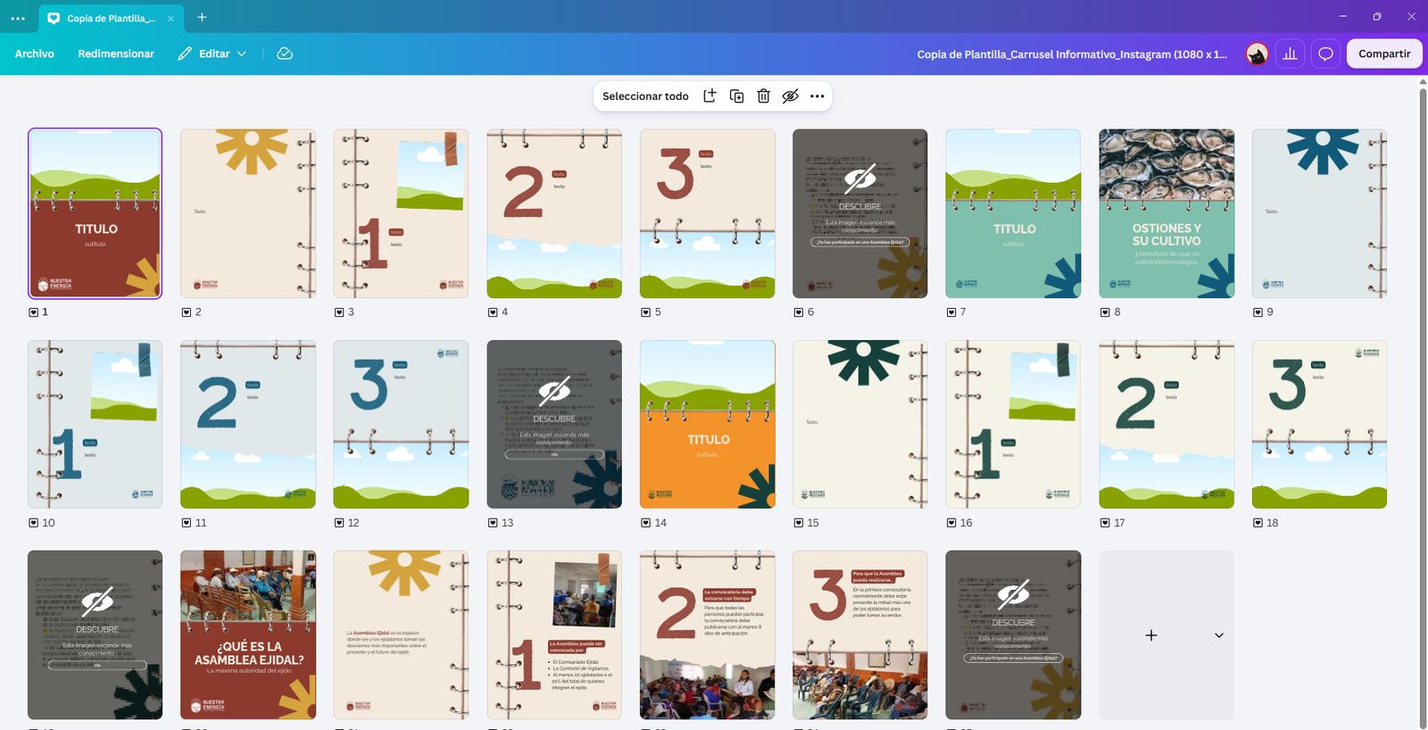
I built the brand ecosystem of Entorno a Ti, the Mexican chapter of Swiss organization Our Common Home: from a single logo to a family of program brands, used in community trainings across Mexico and at partner events in Switzerland, Brazil and the United States.
ClientEntorno a Ti — Our Common Home (CH)
RoleCreative direction · Art direction · Design
TeamLed a team of 5
DeliverablesIdentity, brand architecture, social, editorial, information design, events
One brand · Many voices · Entorno a Ti500+people trained14+4municipalities + states5program brands4countries
01Creative directionBrand strategy
The challenge:close, human and Mexican
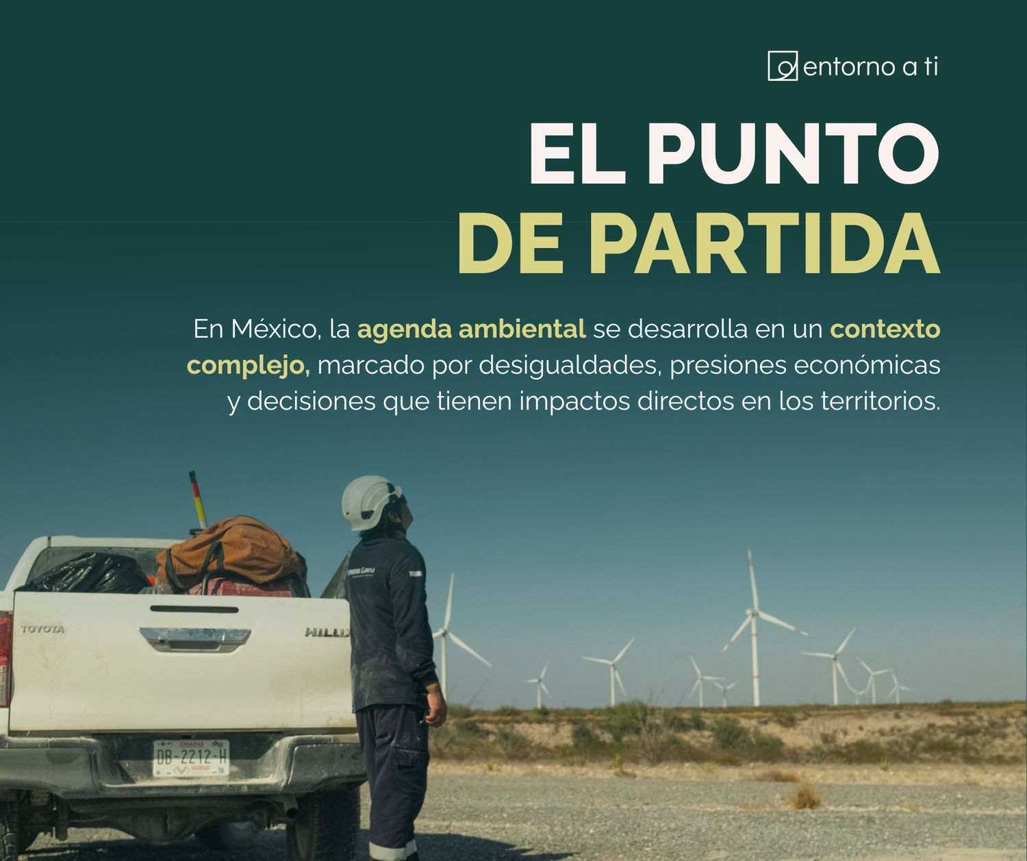
Entorno a Ti is an environmental organization that starts with people. Its work only succeeds when ejido members, fishing communities and local leaders take part in the decisions about their own land, so the brand could not look like one more distant institution.
The differentiator
“The brand had to feel close, human and, above all, Mexican, so that communities would recognize it as their own without the organization losing its institutional credibility.”
ClosePlain language, warm color and real faces instead of the cold vocabulary of policy and compliance.
HumanCommunities as protagonists, never as beneficiaries or victims, in every image and every sentence.
MexicanSymbols, textures and graphic traditions people already know from their own territory, reinterpreted without falling into folklore.
CredibleA rigorous system that still works in front of the Senate, foundations and international partners.
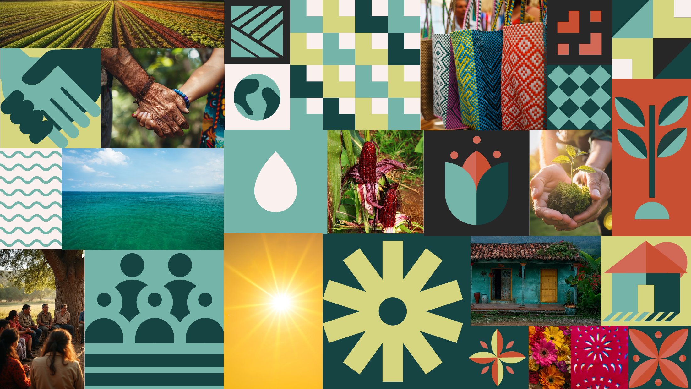
Entorno a Ti only had a logo. I built the full identity around it: logo system, color, typography, iconography, graphic elements and the brandbook that let any designer apply it consistently.
Before
A logo, and no system around it.
After
A full identity with color, type, icons and pattern.
Brand boardEntorno a Ti · 2025
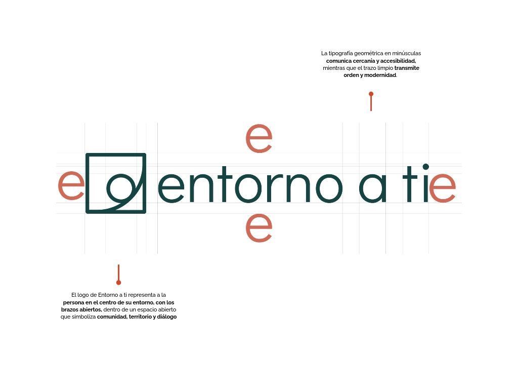
01 · Iconography02 · Master logoThe square and the circle: the person at the center of their environment.
04 · Logo construction05 · Primary typeAaRalewayABCDEFGHIJKLMNÑOPQRSTUVWXYZ abcdefghijklmnñopqrstuvwxyz 012345678906 · Secondary typeCreme GlaceeCollateral and special pieces for community audiences
The study behind the identity
Before designing, I wrote a brand study to understand who the organization speaks to and why its old visual language was not working: functional, but generic and institutional, with no story and no cultural roots.
Primary audienceRural communities and environment-dependent livelihoodsRural communities and people whose income depends on activities tied to the environment, such as waste pickers, farmers and fishers, along with community leaders. They want to be heard, closeness and clarity, and support without imposition.How they should feel: accompanied, heard and treated with dignity.
Secondary audienceInstitutions and strategic alliesPublic officials, NGOs, foundations, international partners and ESG leaders, 30 to 55. They look for credibility, transparency and reliable data.How they should feel: confident they are dealing with a transparent, effective organization.
What the brand needed
Connect emotionally with communities and donors
Own Mexican cultural and natural references without falling into clichés
One consistent visual language across every touchpoint
Turn the website into a platform for stories, not just a repository
Visual narrative study
From functional to emotional and territorial.
What was missing
The logo and its applications told no story: flat, with nothing that connected emotionally.
No secondary graphic language (patterns, textures, iconography) to express cultural and territorial identity.
A generic, institutional tone that did not reflect Mexican roots or community strength.
What the narrative needed
Identity symbols that evoke tradition, nature and community.
A coherent, recognizable system across every touchpoint.
Pieces that carry cultural roots and active hope, connected to everyday rural life.
Two levels of communication
The system works on two levels, so it can speak to very different audiences without losing coherence: warmth and cultural roots inward, seriousness and credibility outward.
Level 01 · CommunitiesField manuals, Facebook and learning resourcesWarm, illustrated pieces with plain language, documentary photography and a display typeface that feels close and handmade, as in the training manuals and the Voces del Territorio and Programs in action series.
Level 02 · Institutions and alliesAnnual report, formal presentations and LinkedInGeometric, institutional iconography and restrained graphics that project professionalism and support the organization's legitimacy before partners, institutions and international bodies.
03Creative directionBrand strategy
A brand ecosystembuilt to grow
Each program got its own identity and brandbook, with its own personality, while clearly belonging to the Entorno a Ti family. Event identities and collaborations with partners extended the same system.
Entorno a TiMaster brand · Mexican chapter of Our Common Home (CH)
·Program brands
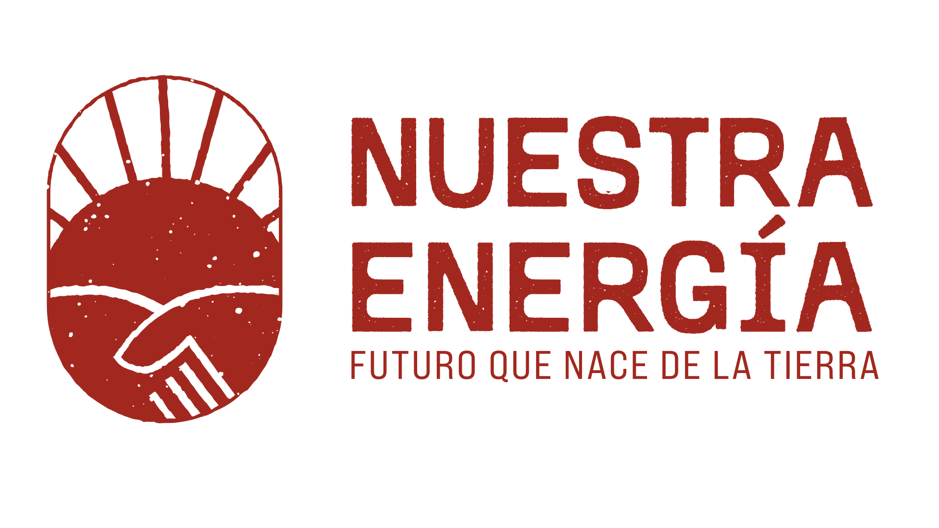
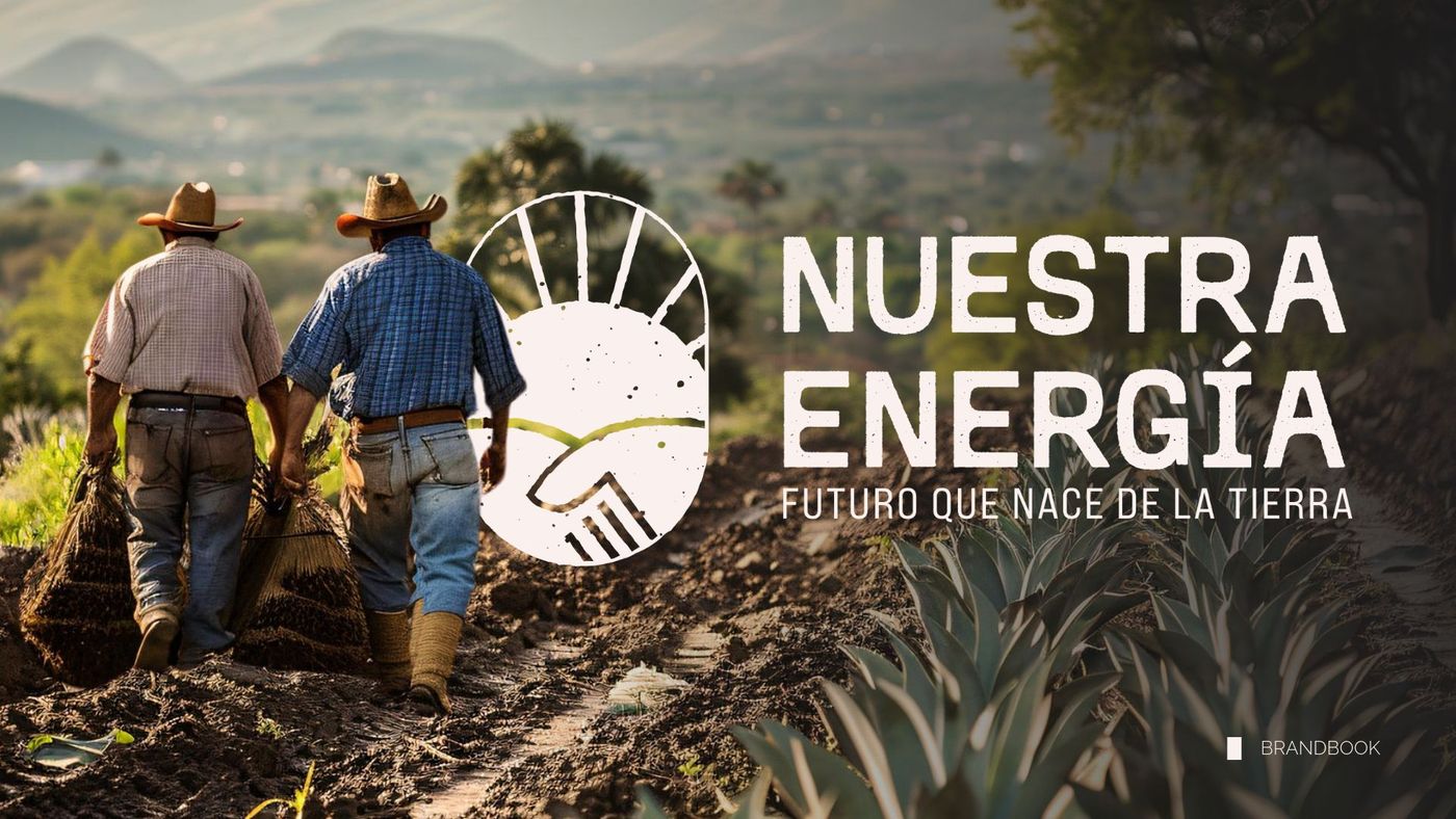
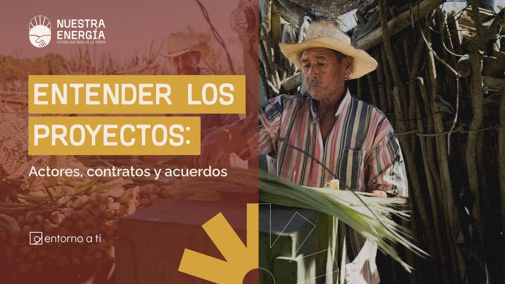
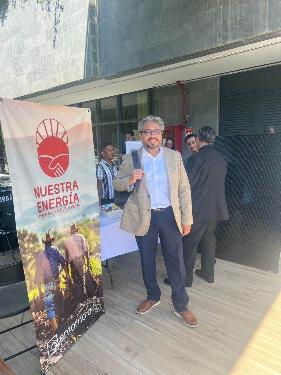
Nuestra EnergíaSolar energy
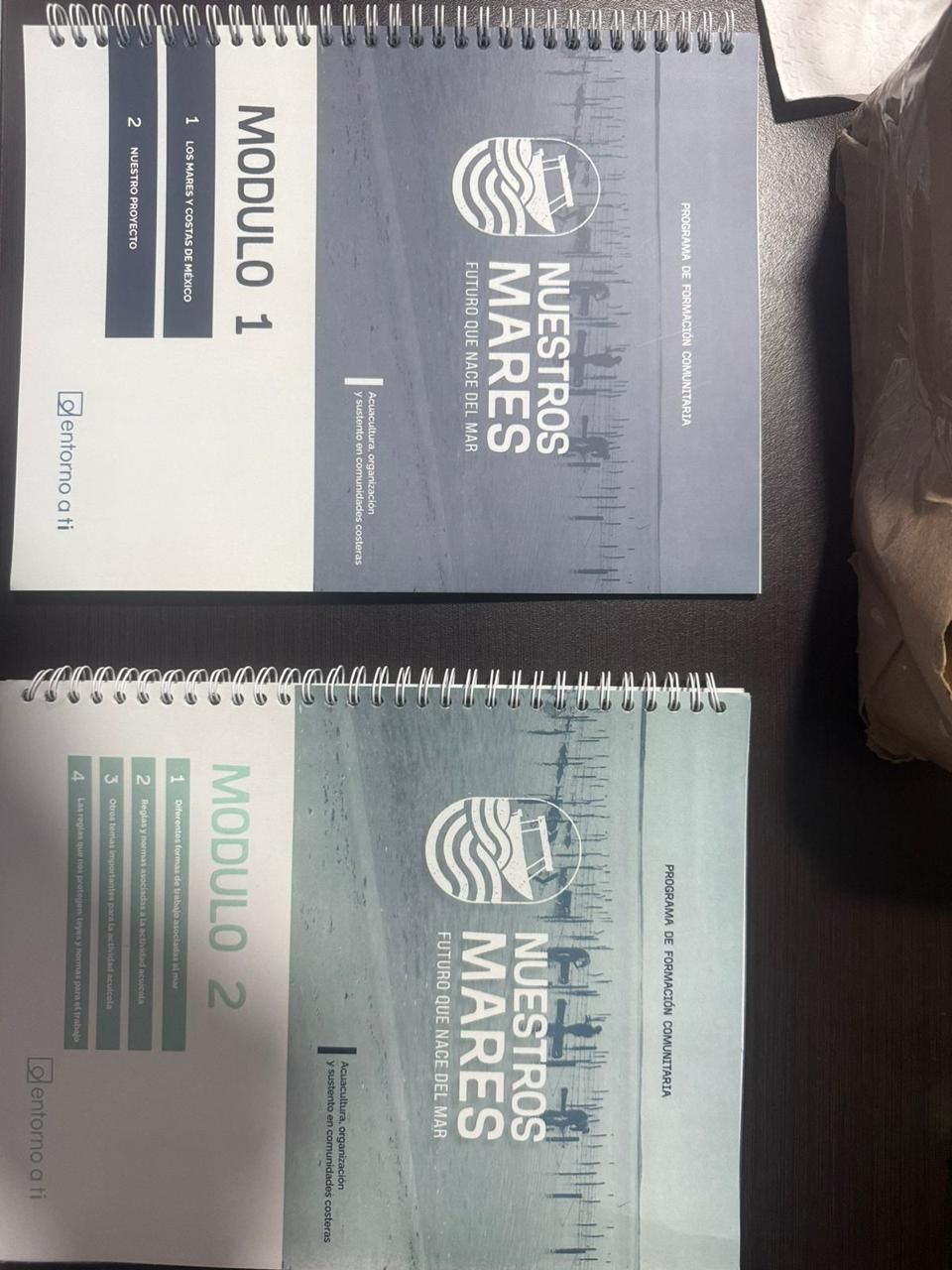
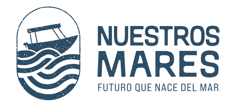
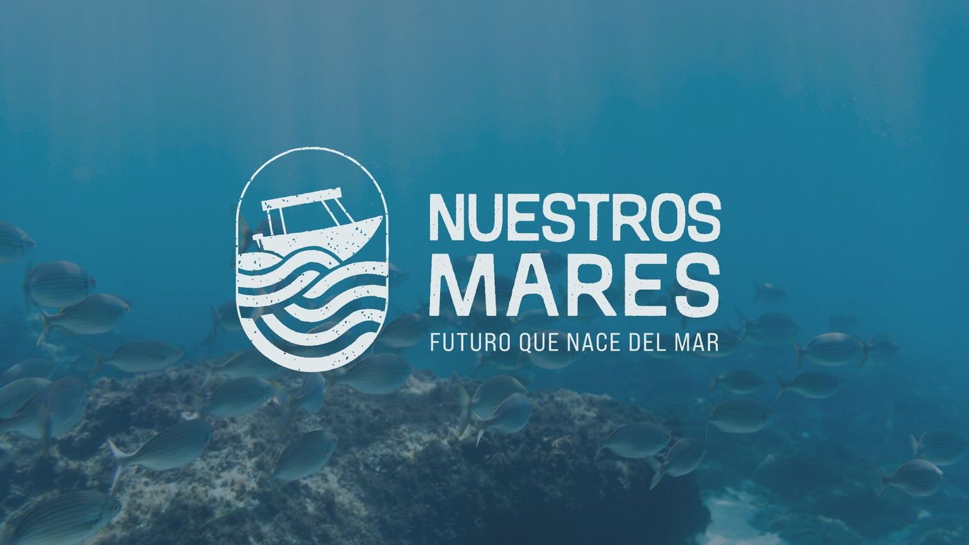
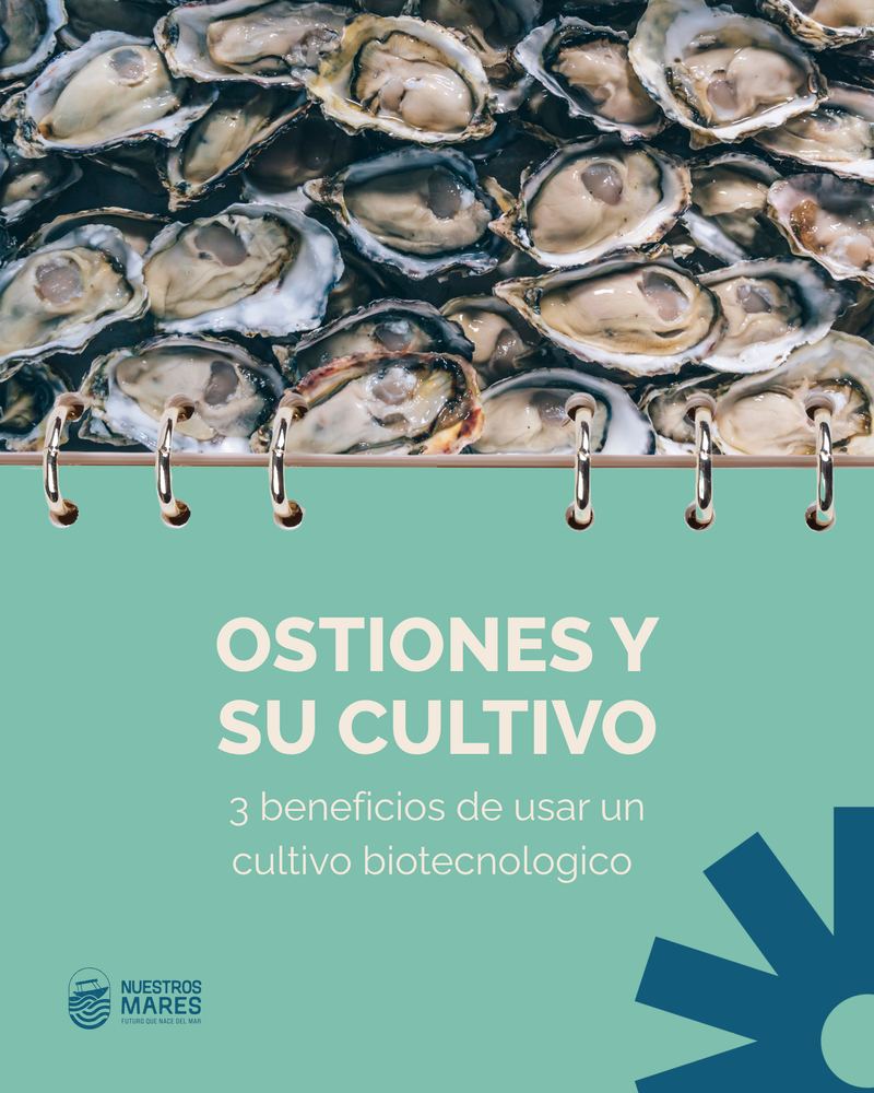
Nuestros MaresFishing and aquaculture
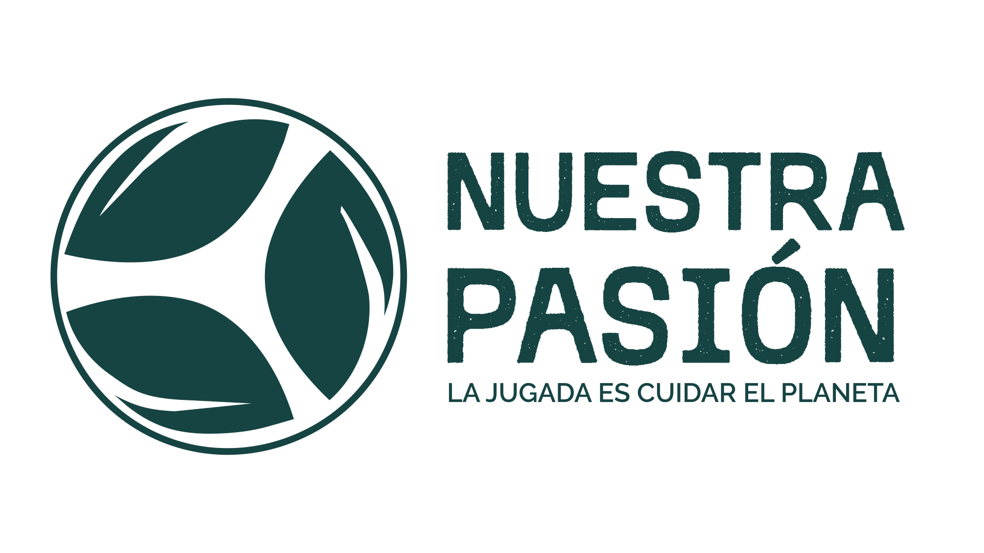
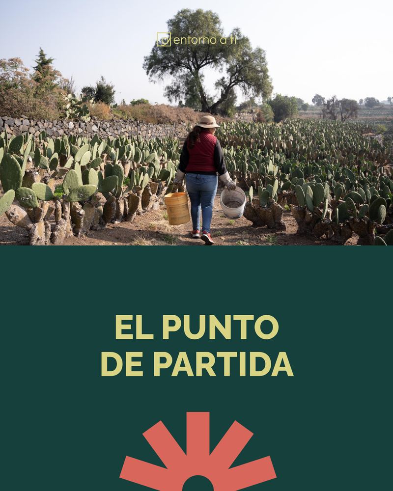
Nuestra PasiónCircular economy
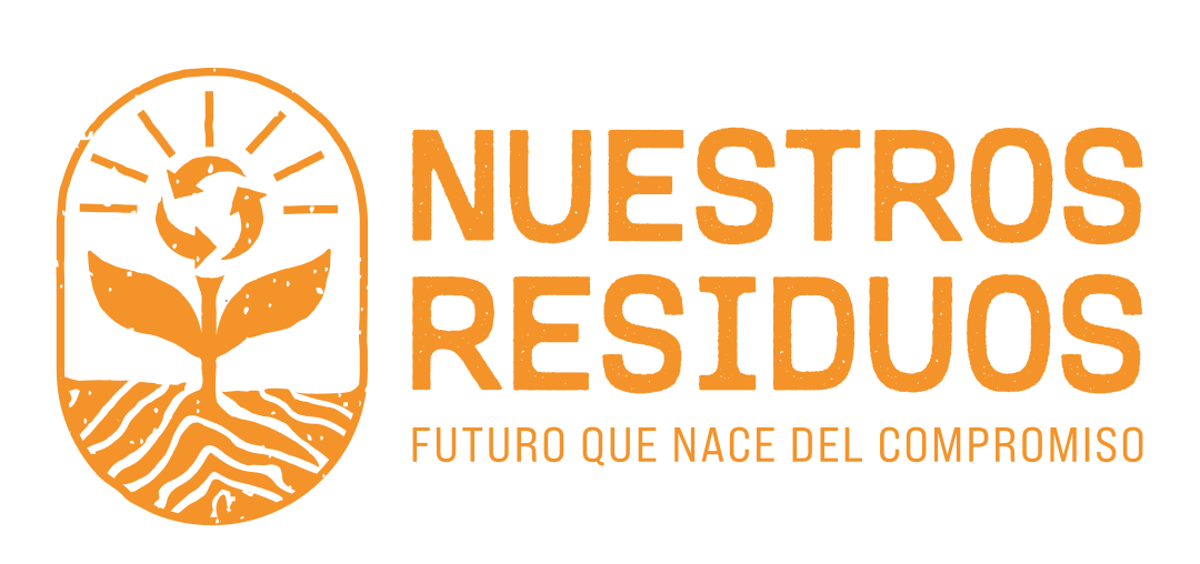
Nuestros ResiduosWaste
Nuestro EntornoIn development
Event identities
Raíces y FuturoSenate · Mexico
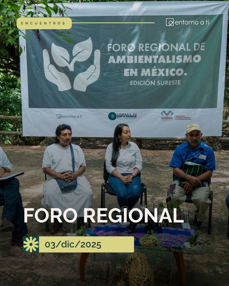
Foro RegionalEnvironmentalism in Mexico
Collaborations
Entorno a la CreaciónBrazil
Postliberal EcologySwitzerland
University of Essex + UNAMUnited Kingdom · Mexico
FIL GuadalajaraInternational Book Fair
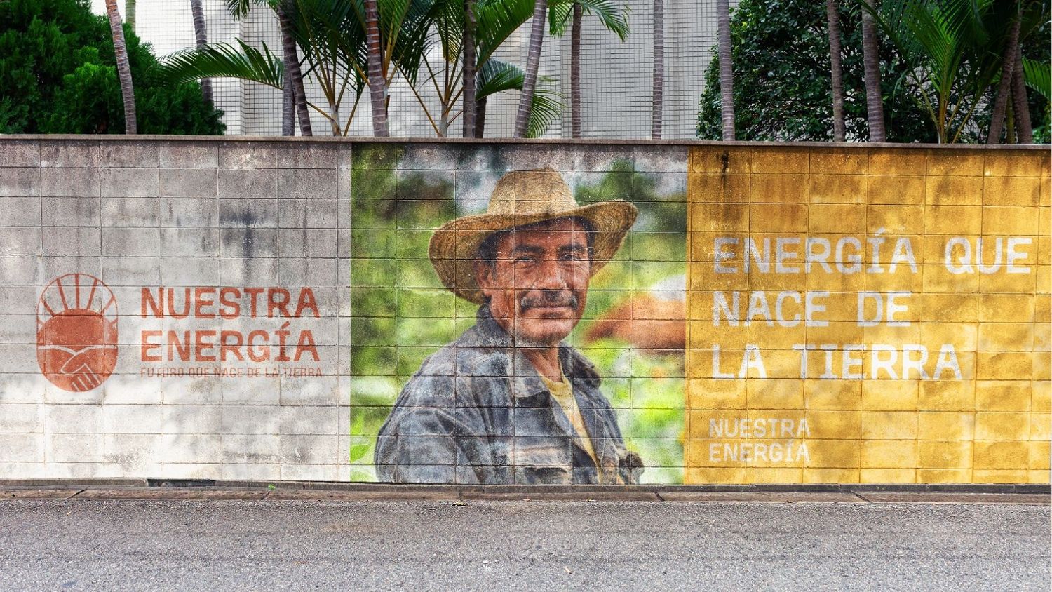
Key visuals from each program's brandbook: one family, each with its own personality.
04DesignSocial media
A social media system,not just posts
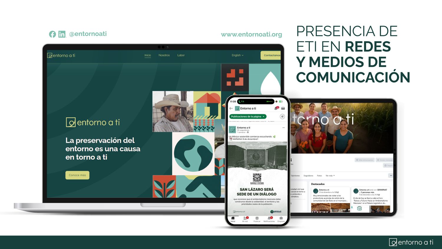
I designed the content ecosystem behind Entorno a Ti's channels: editorial principles, four thematic pillars, recurring series and a template for each format. Every template was built in Canva, so the whole team, including people with no design background, could publish for the organization and for each program without breaking the system.
Every post must meet at least one of these goals
01Build trust“We are a serious, close and transparent organization.”
02Make communities visible“People are the protagonists, not the beneficiaries.”
03Bring sustainability into daily life“The environment connects with work, family, water and wellbeing.”
04Inspire participation“Everyone has a place in building the future.”
9:41· · ·Entorno a Ti······
The feed
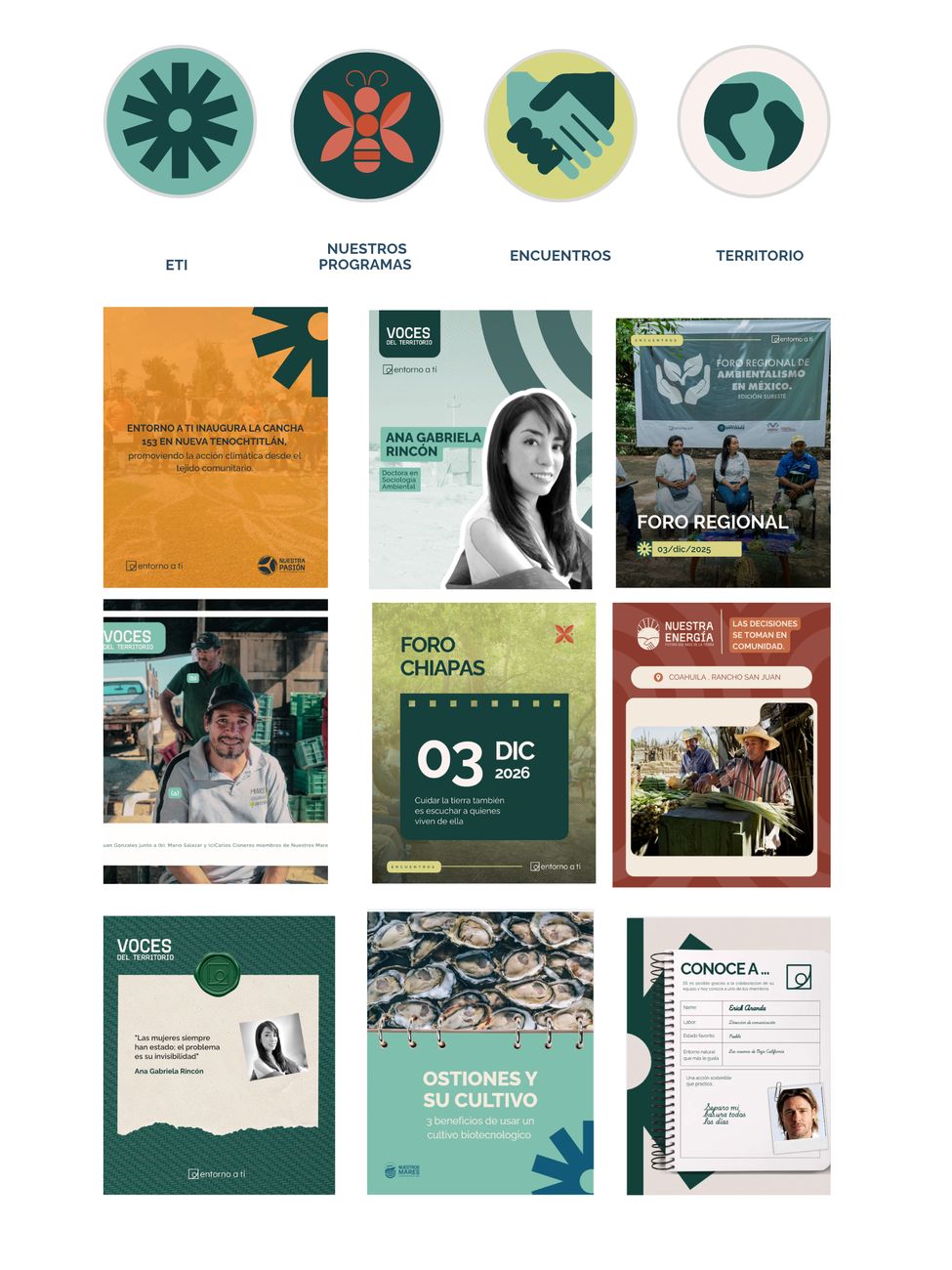
Highlights split by pillar (ETI, Our programs, Encounters, Territory), so a new visitor understands the organization in one scroll. The grid alternates pillars to keep the feed balanced.
···Canva · Entorno a Ti templates
Every template lives in Canva, linked from the content ecosystem guide.
Four thematic pillars Scroll each row to see more pieces
01
Programs in actionProgramas en acción
GoalShow that sustainability is practical, human and possible.
“Transformation starts in the territories and is built together with communities.”
GoalBuild identity and institutional trust: who we are, what we believe and why we exist.
“We are building a social majority to care for our environment.”
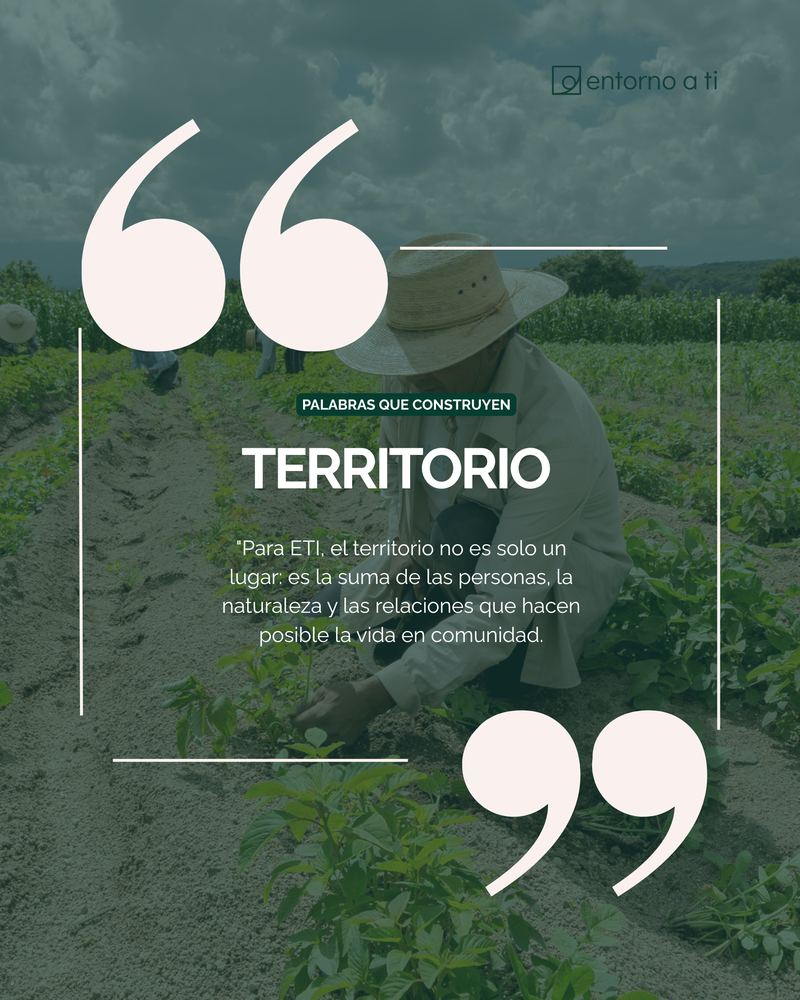
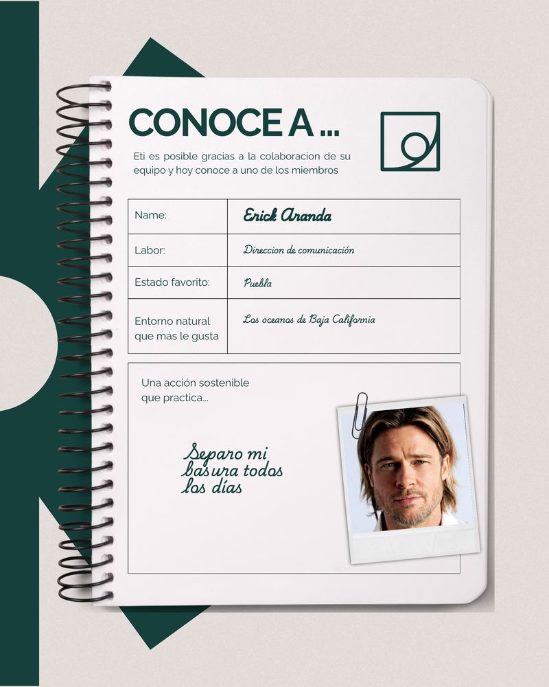
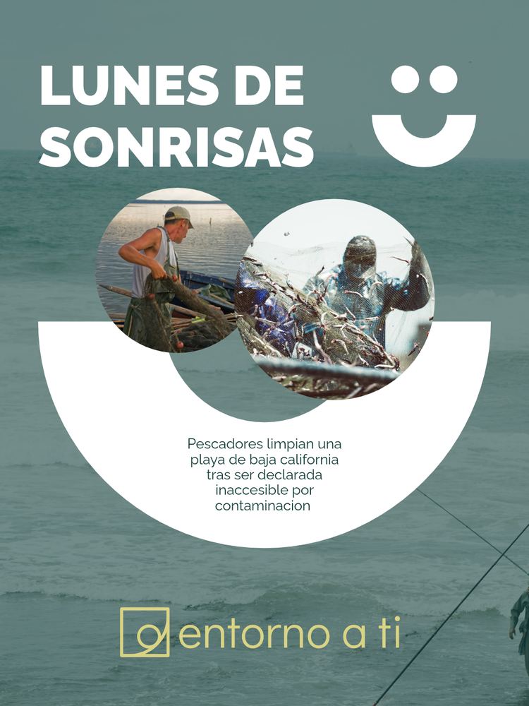
TemplatesWho we areHow we workOur teamWords that buildMonday smilesDid you know?In context
Built for non-designers.A guide explains when to use each template, what it is for and real examples, with a link to its Canva file. The result: consistent posts from a team of communicators, facilitators and program staff.
05Deep diveInformation designInclusive design
Nuestra Energía:turning contracts into conversations
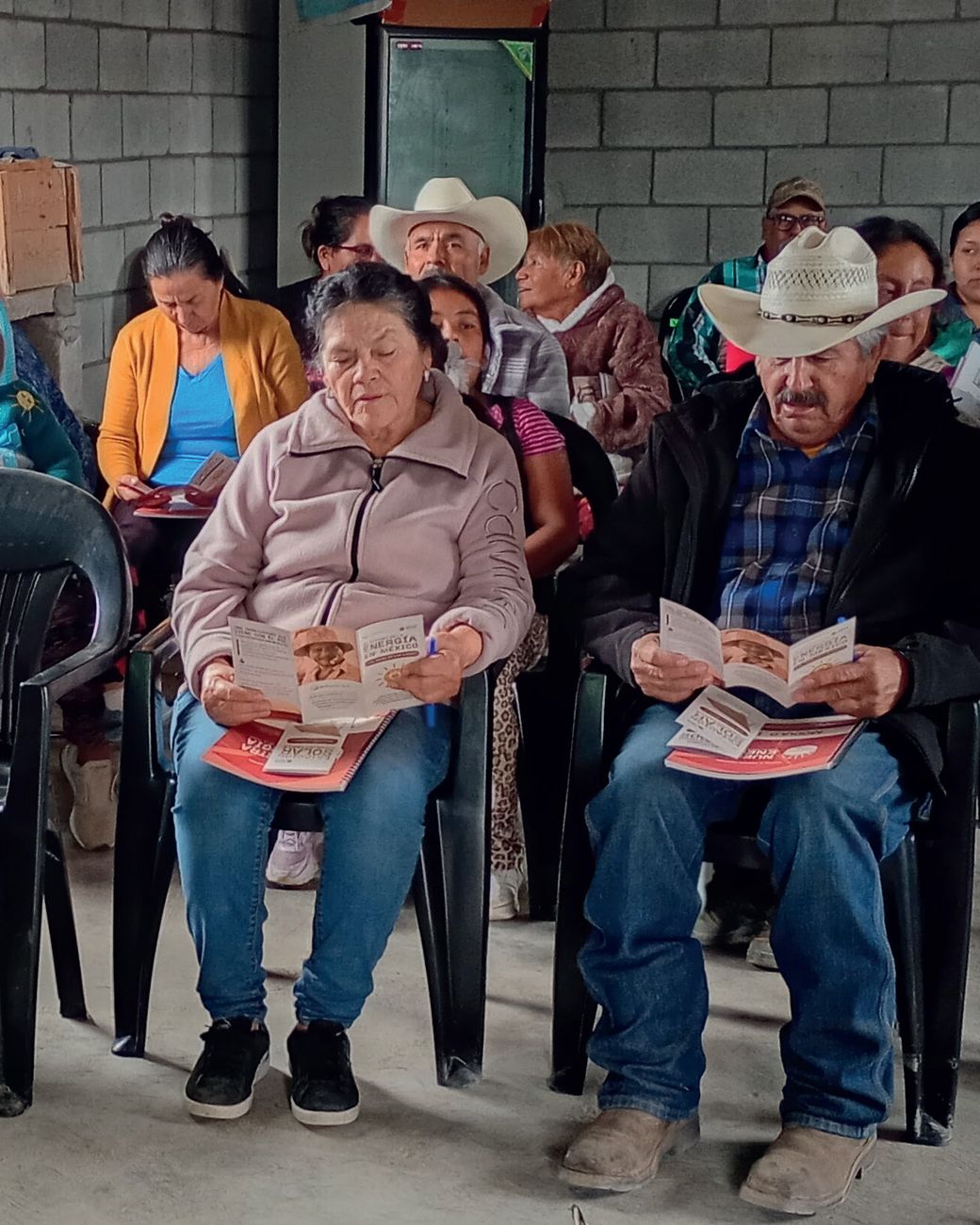
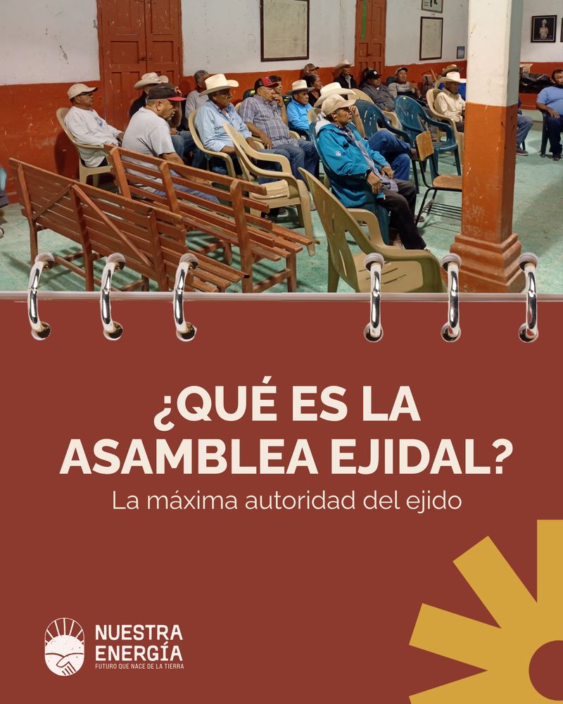
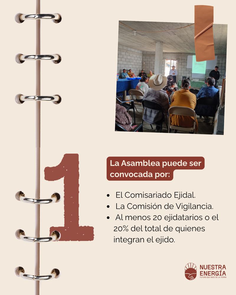
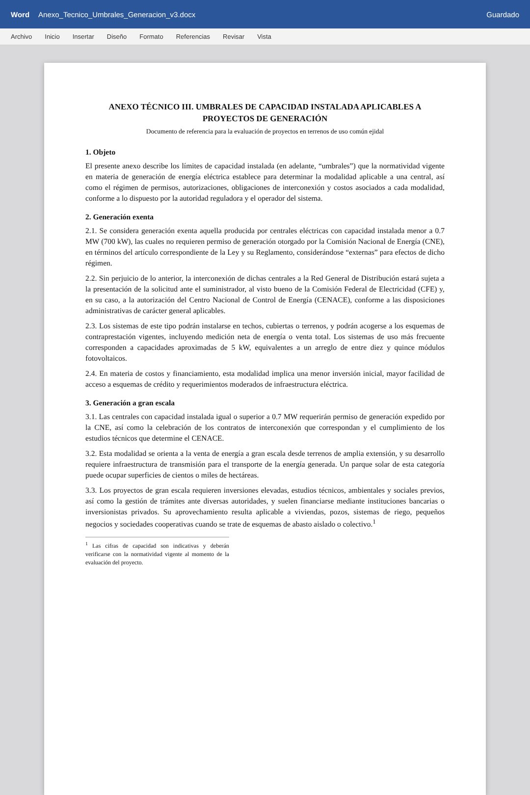
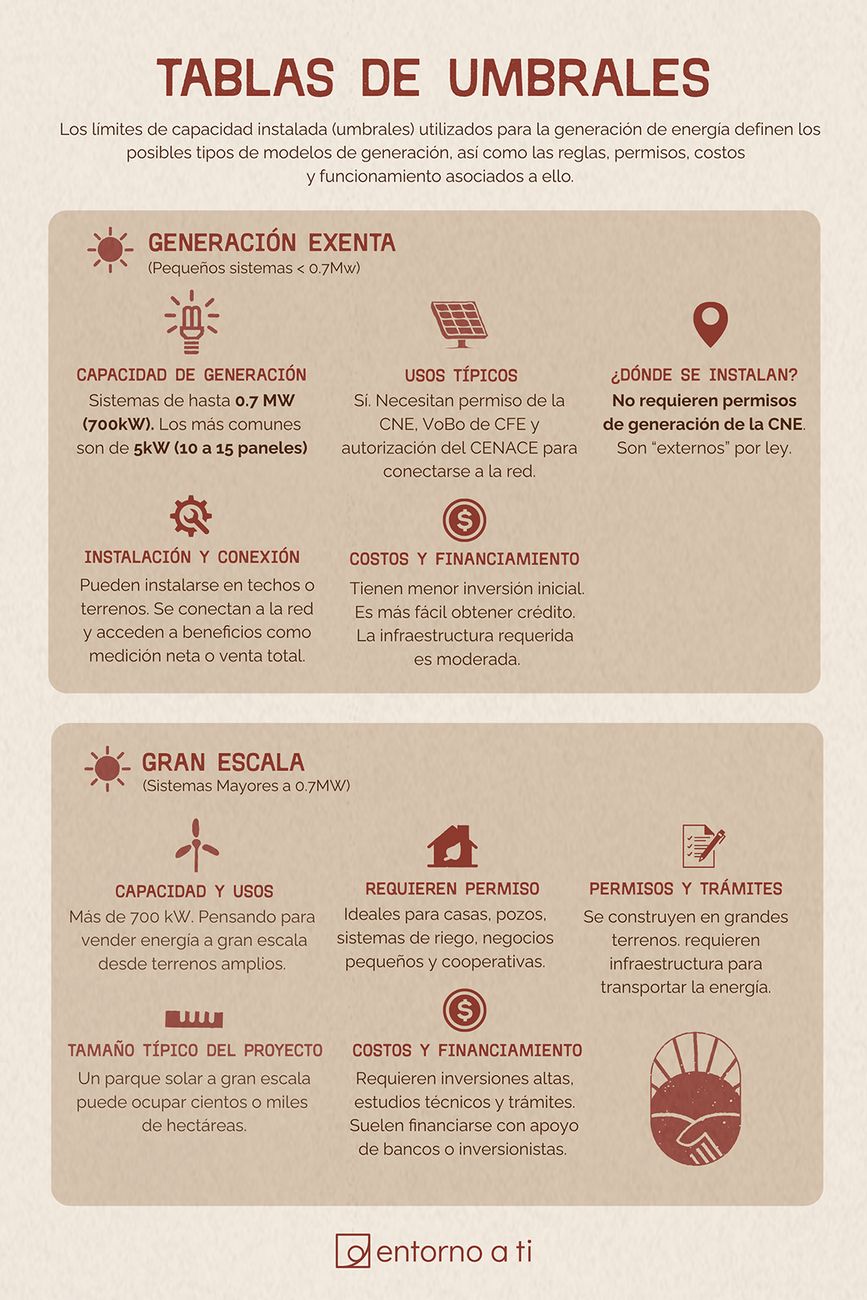
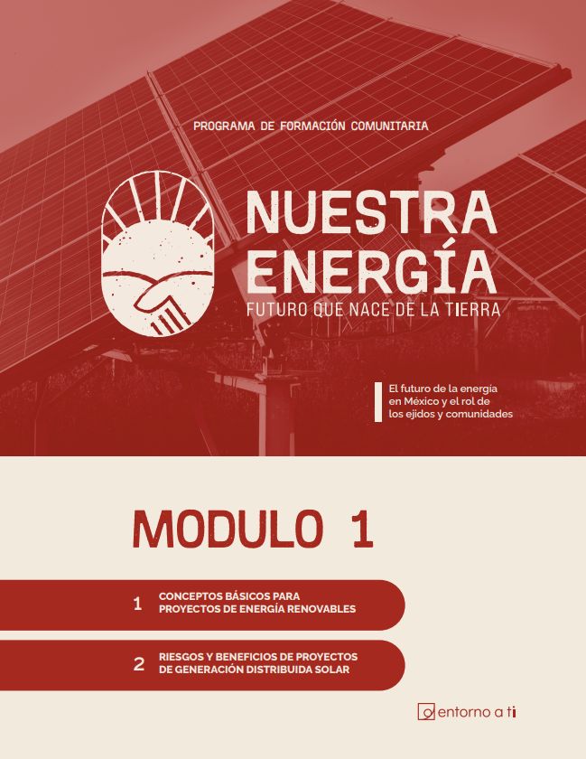
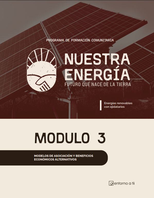
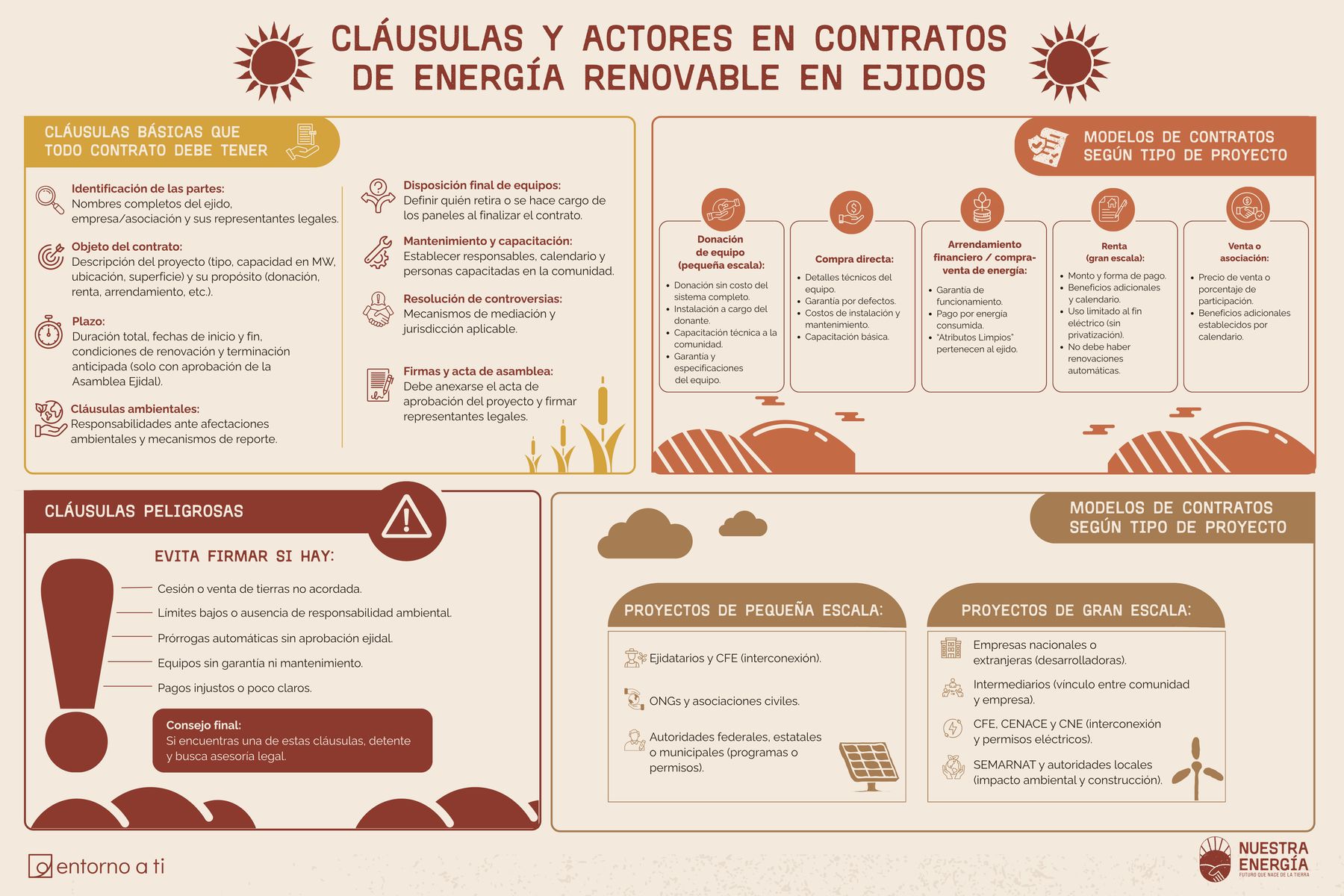
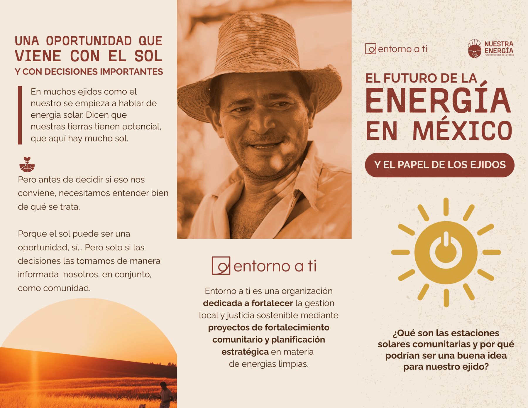
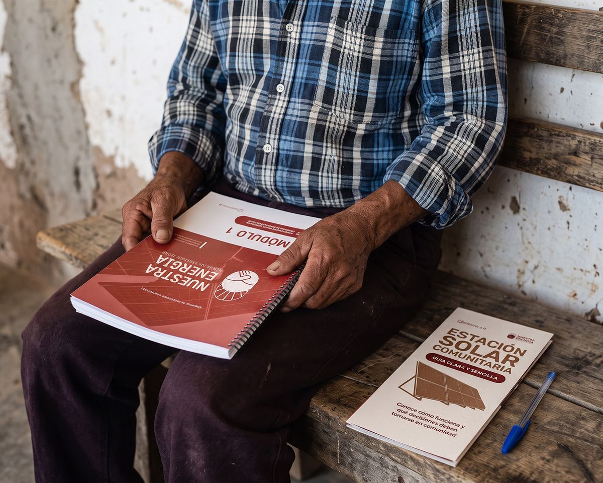
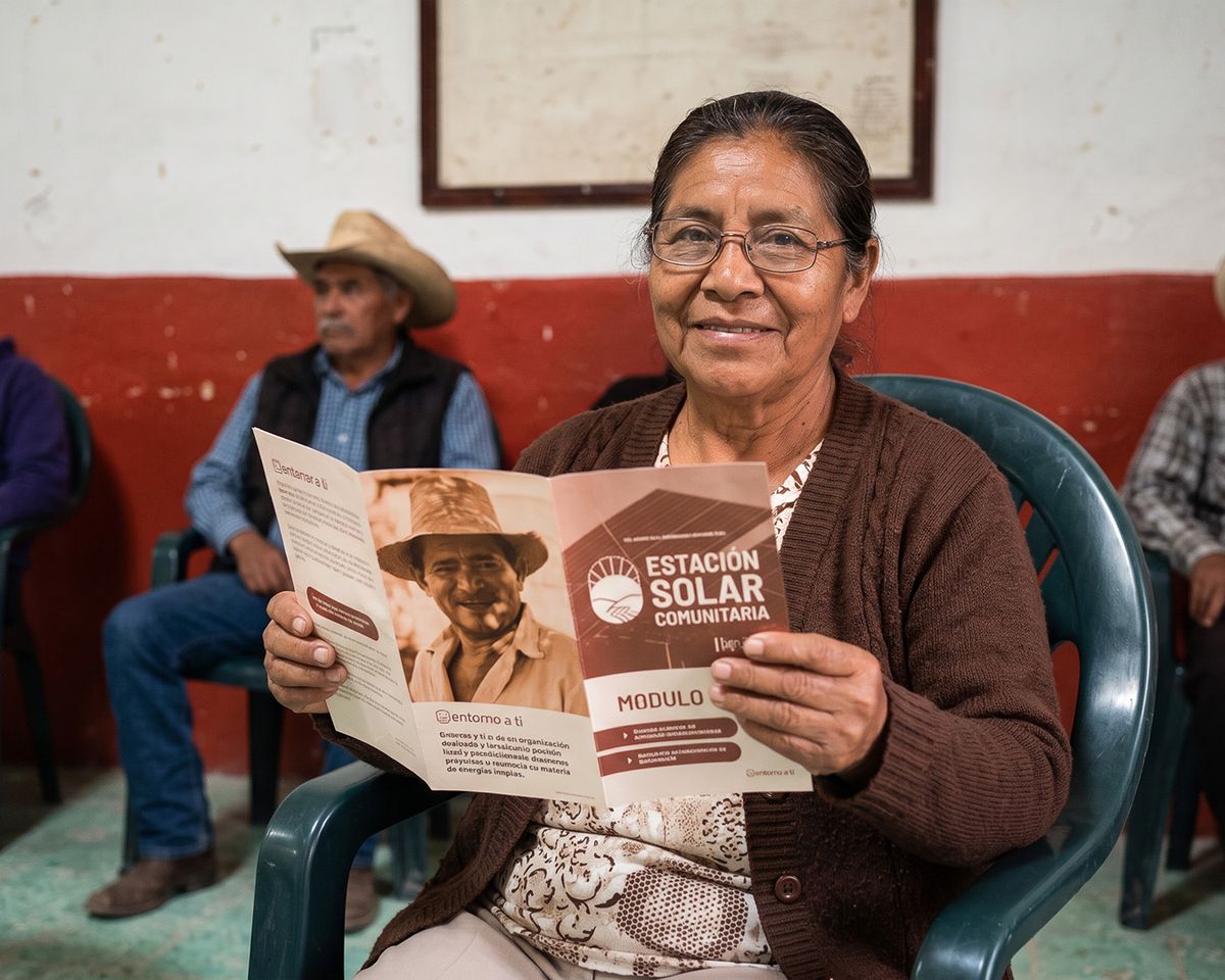
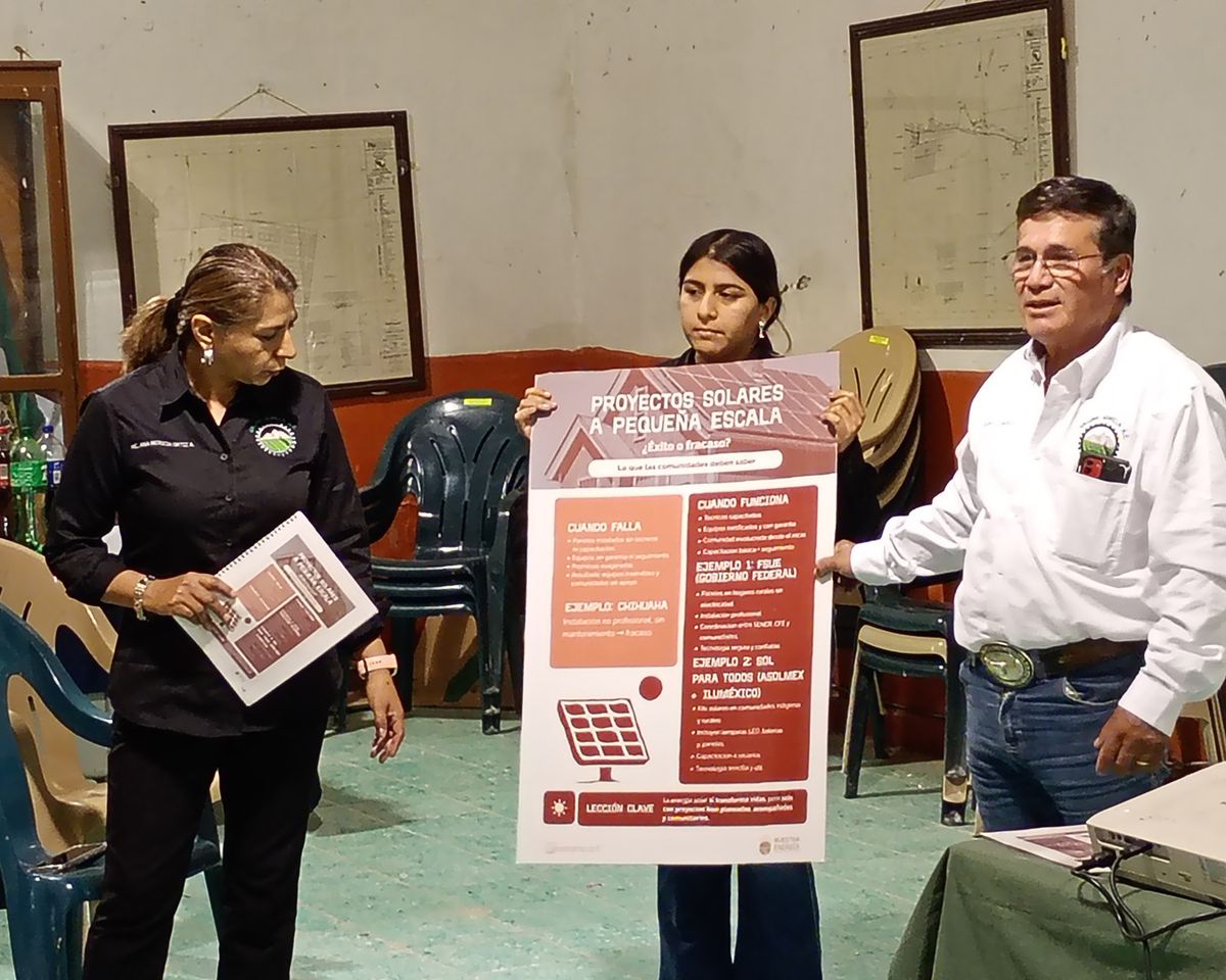
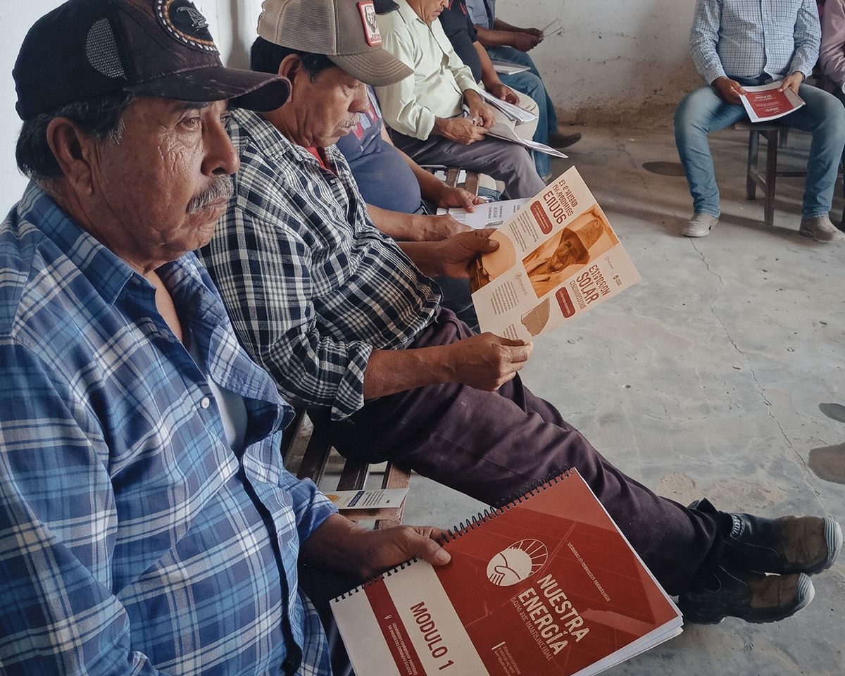
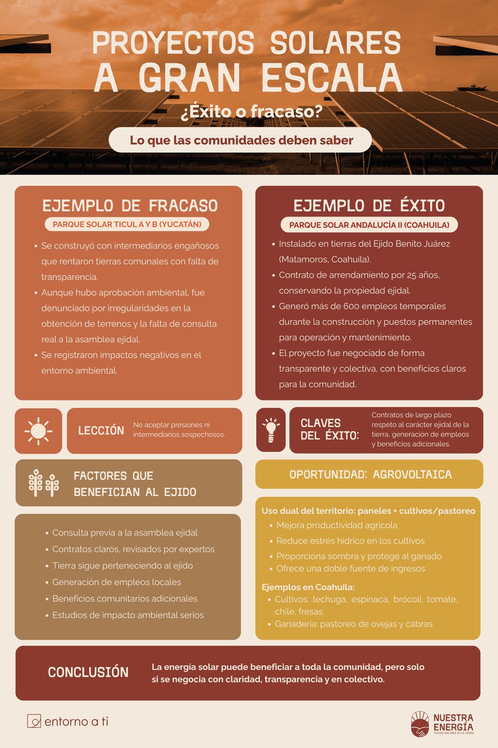
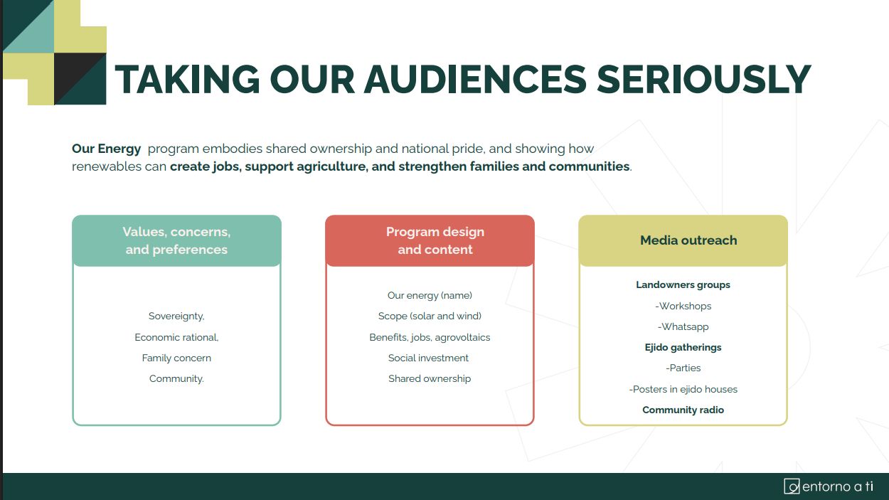
Solar contracts, ejido rights and free, prior and informed consent are dense, technical topics. I turned them into a series of three manuals, infographics, posters and leaflets that ejido members could use to discuss and decide on projects in their own land.
3manuals in the Nuestra Energía series
500+printed copies handed out in trainings
Before — source content
Recreation of the technical document as received.
After — visual tool
The same content as a visual table with icons and plain language.
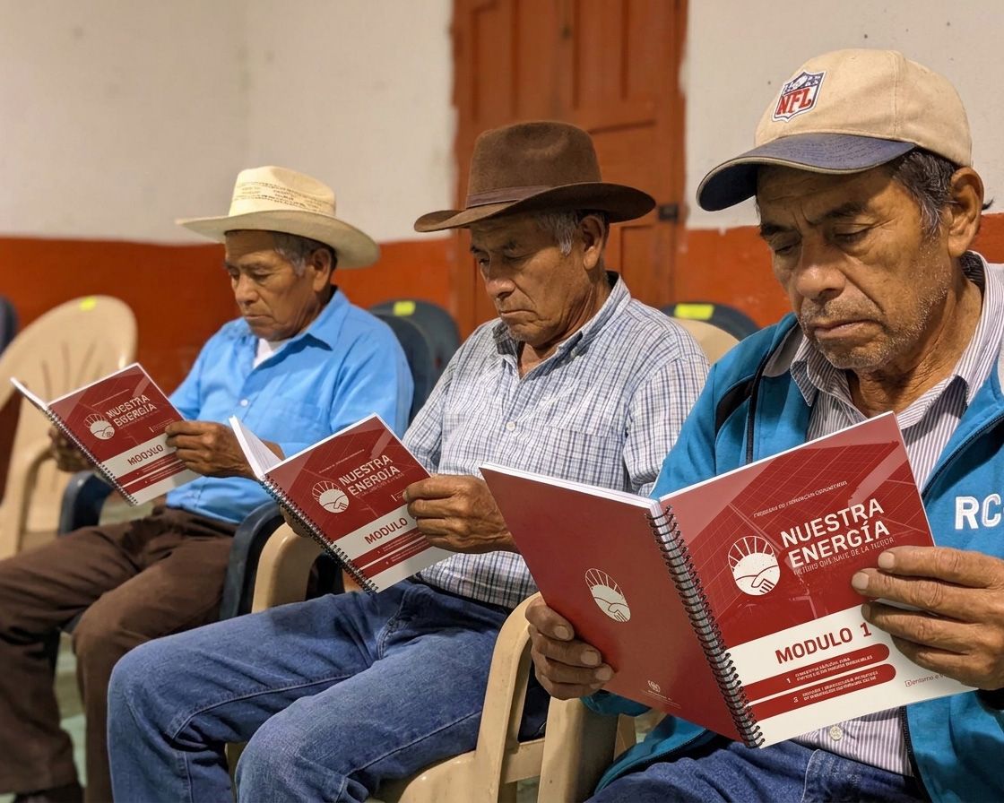
Inclusive by designDesigned forolder eyes.Older ejido members with low vision were the reference user.
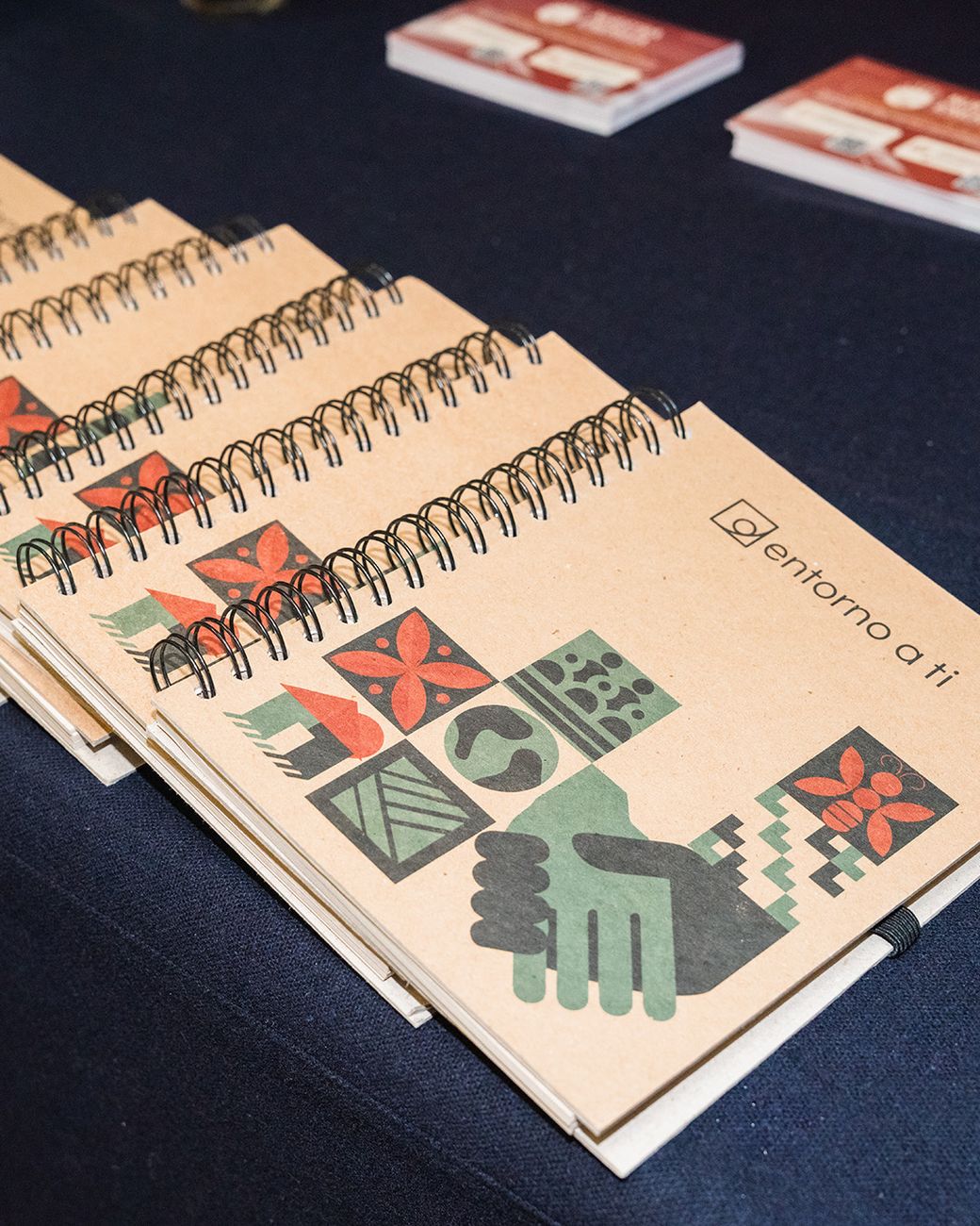
01Spiral-bound, not glued: lies flat on a table and is easy to handle
02Letter-size pages with generous margins and 11 pt minimum text
03High contrast between text and background
04Plain language, short blocks and icons supporting every key idea
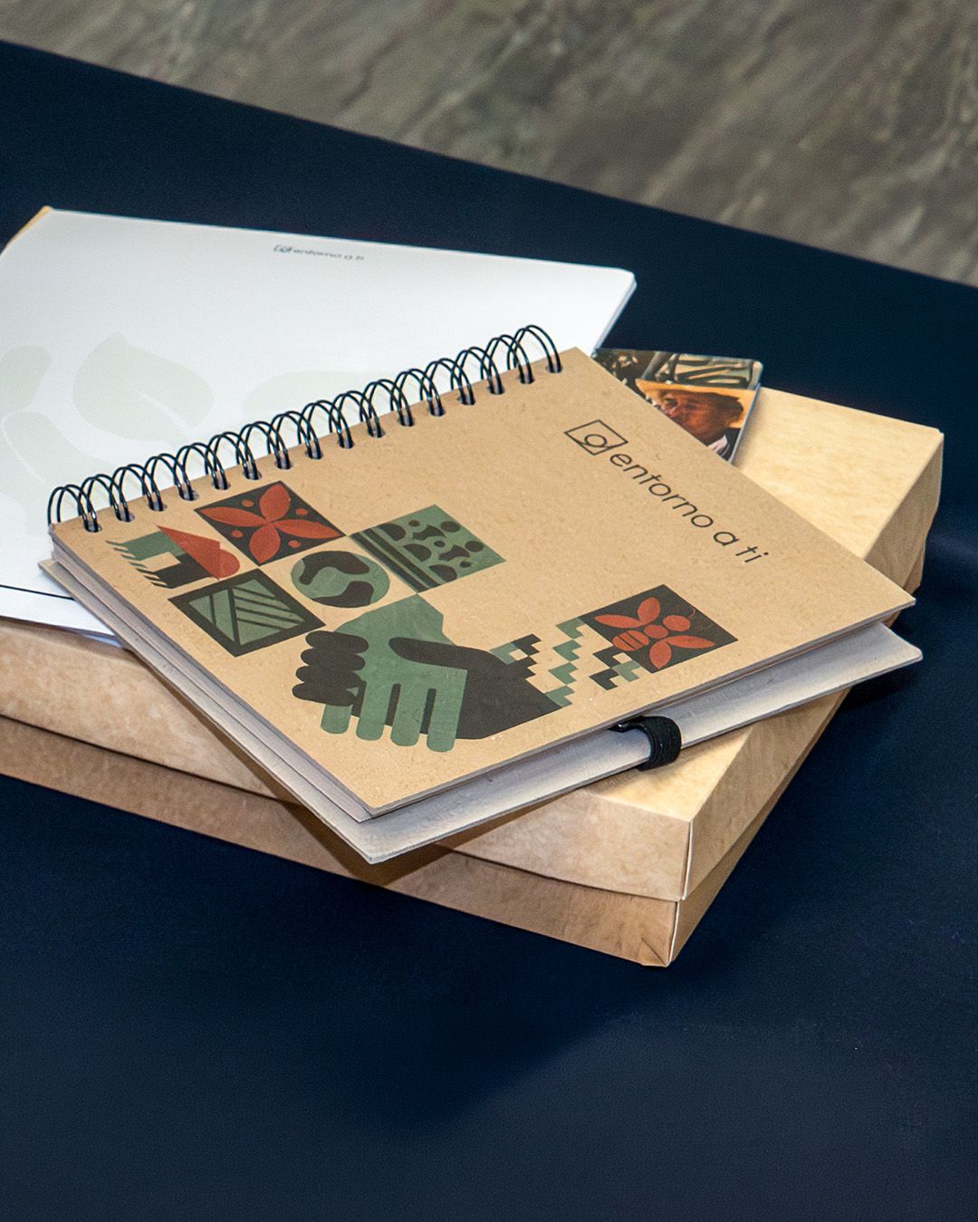
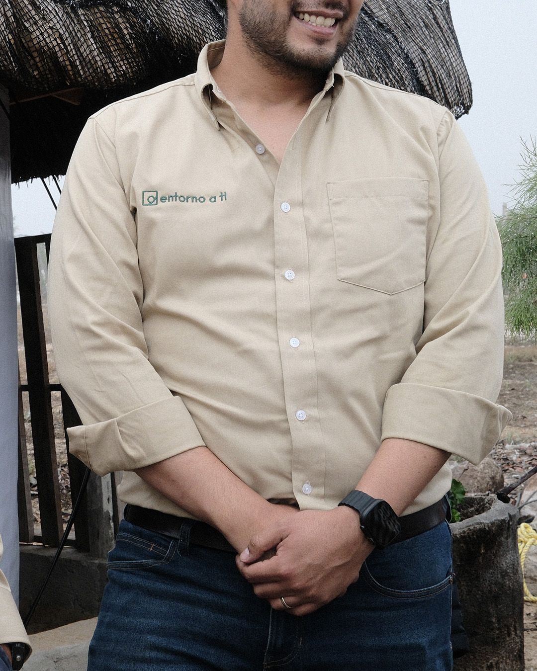
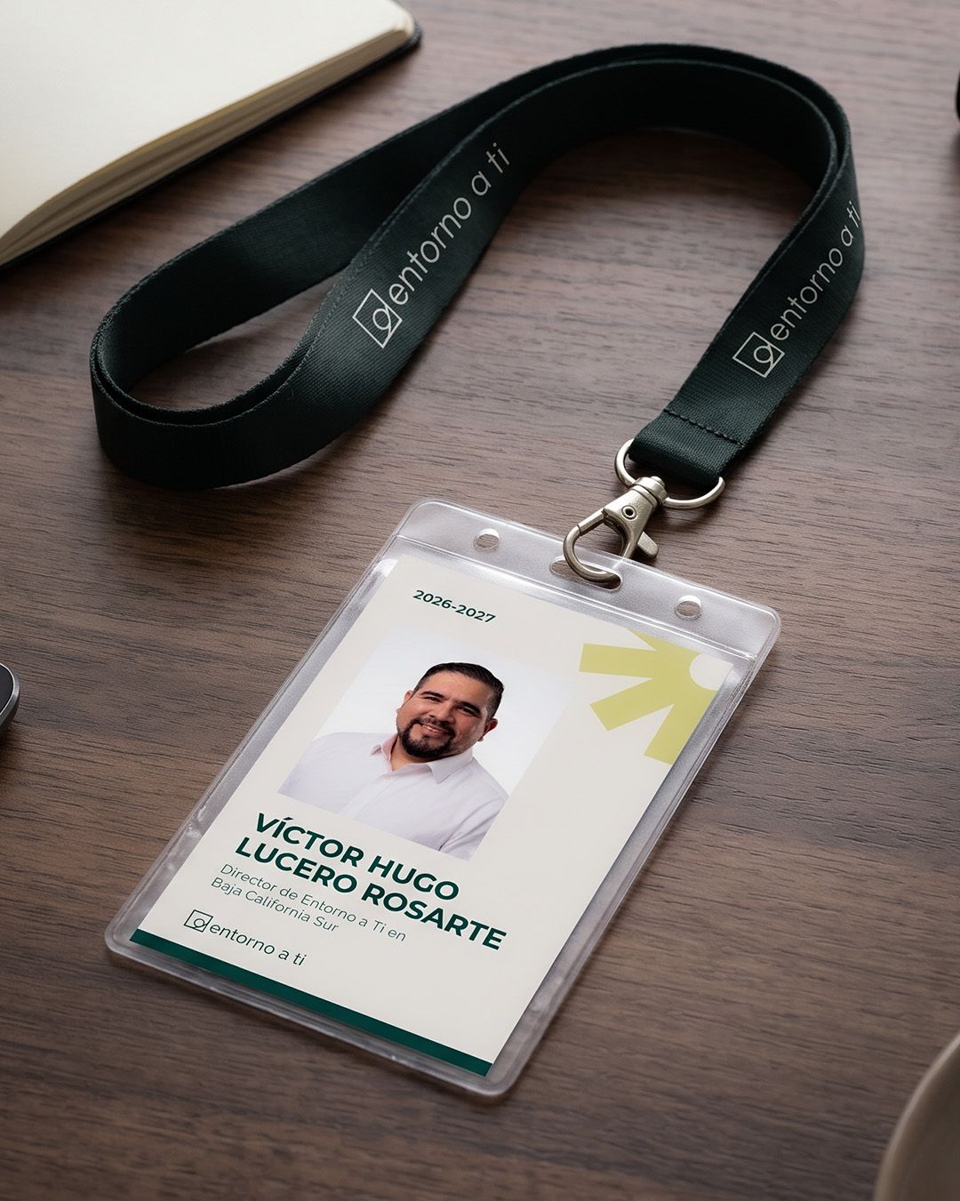
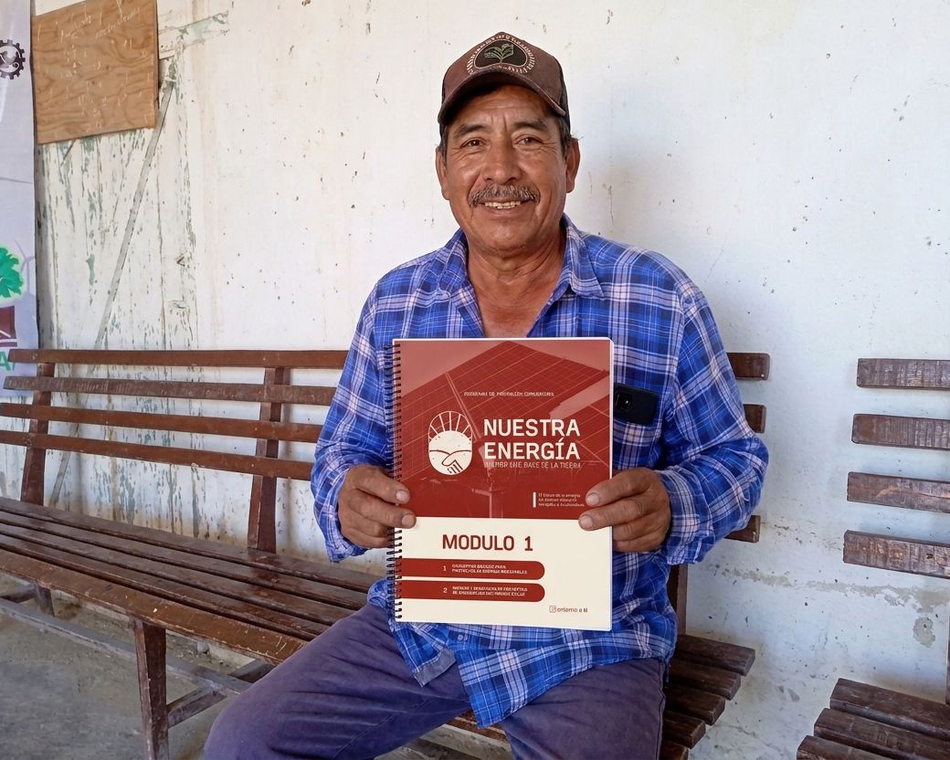
In the hands of the people they were made for
06DesignCampaigns
The systemin action
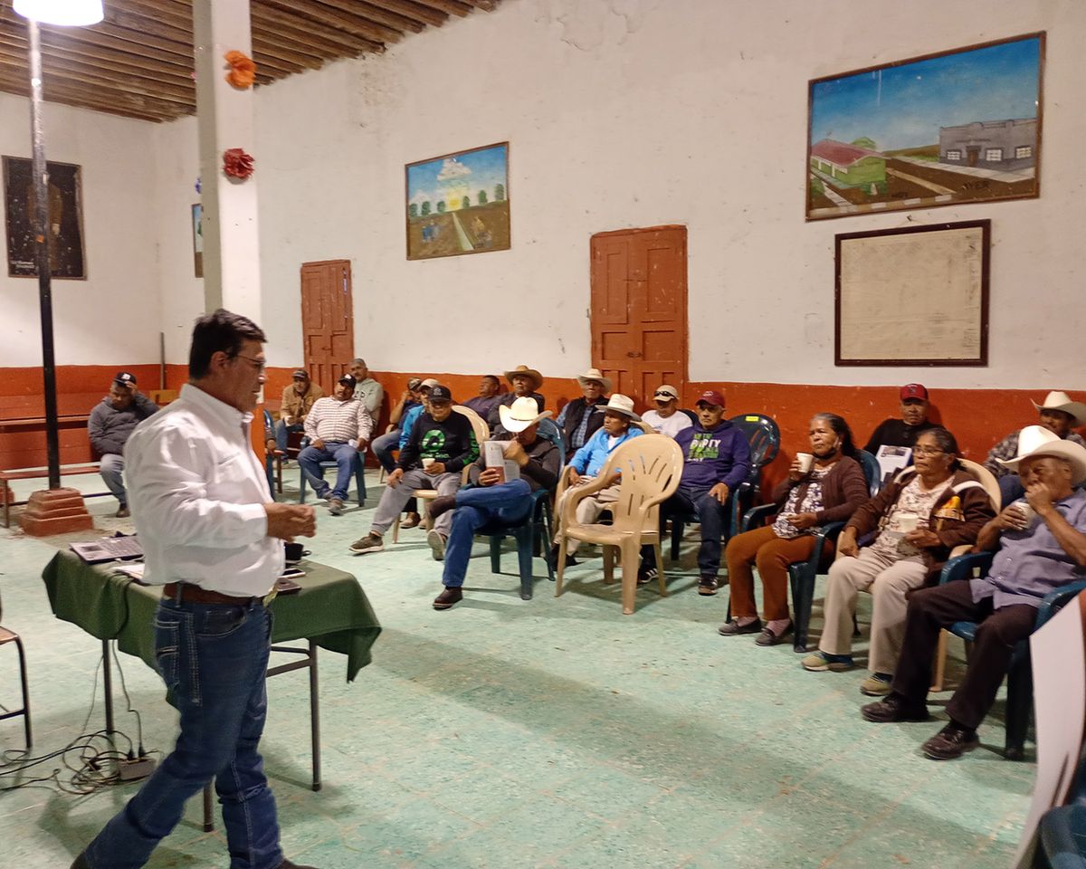
The same logic carried over to other programs, each with its own audience and materials in real use.
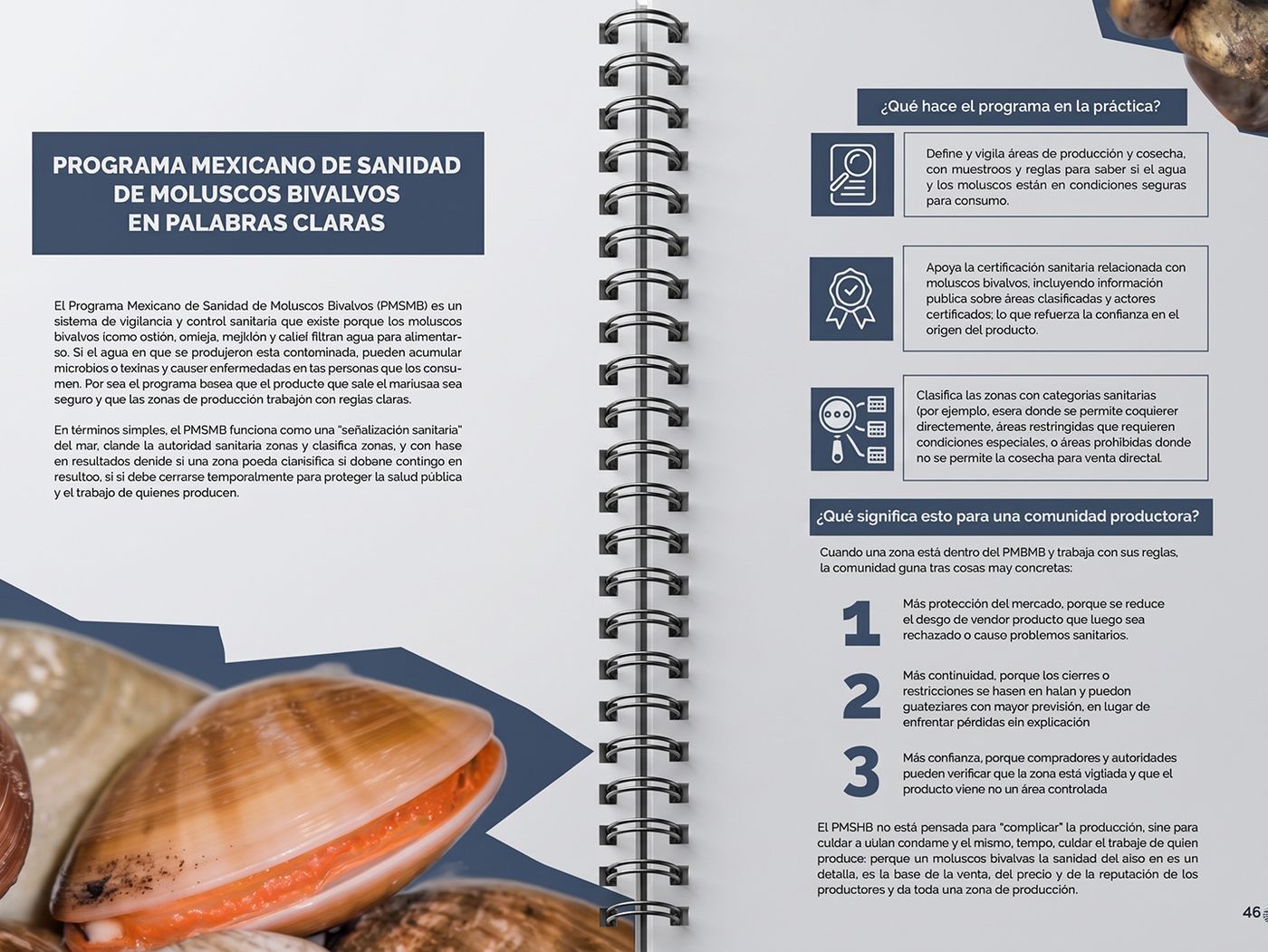
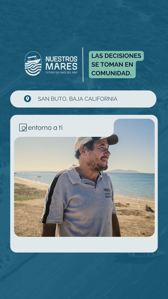
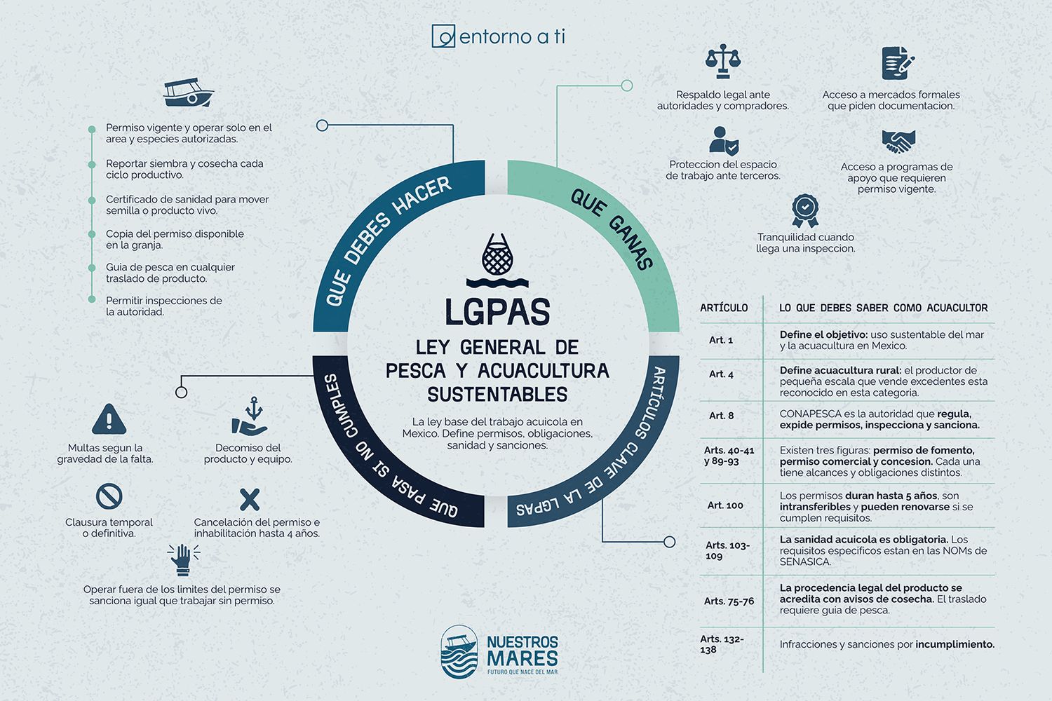
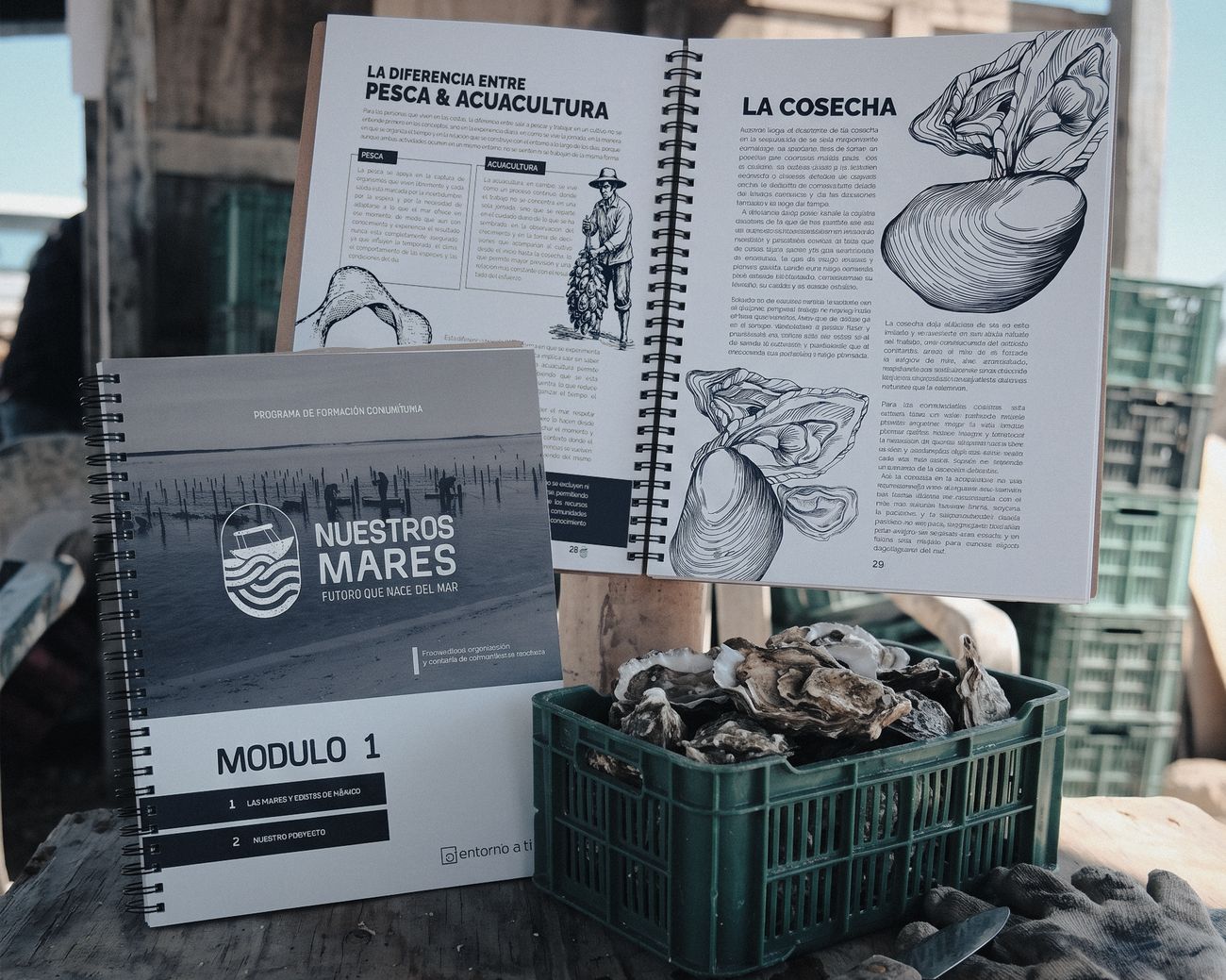
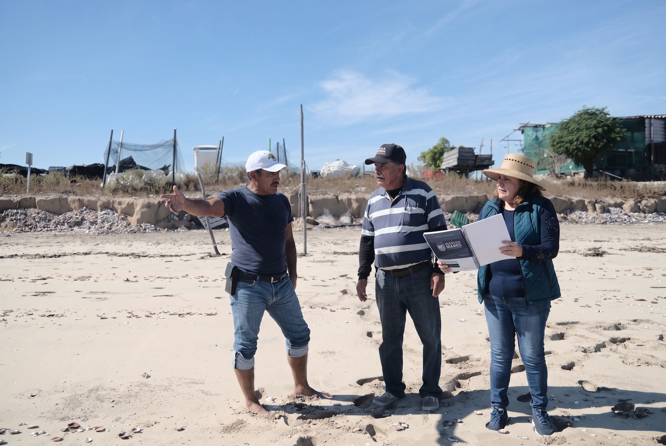
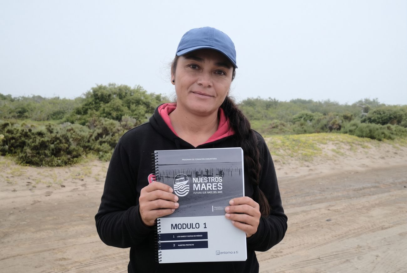
Nuestros MaresFishing law and aquaculture
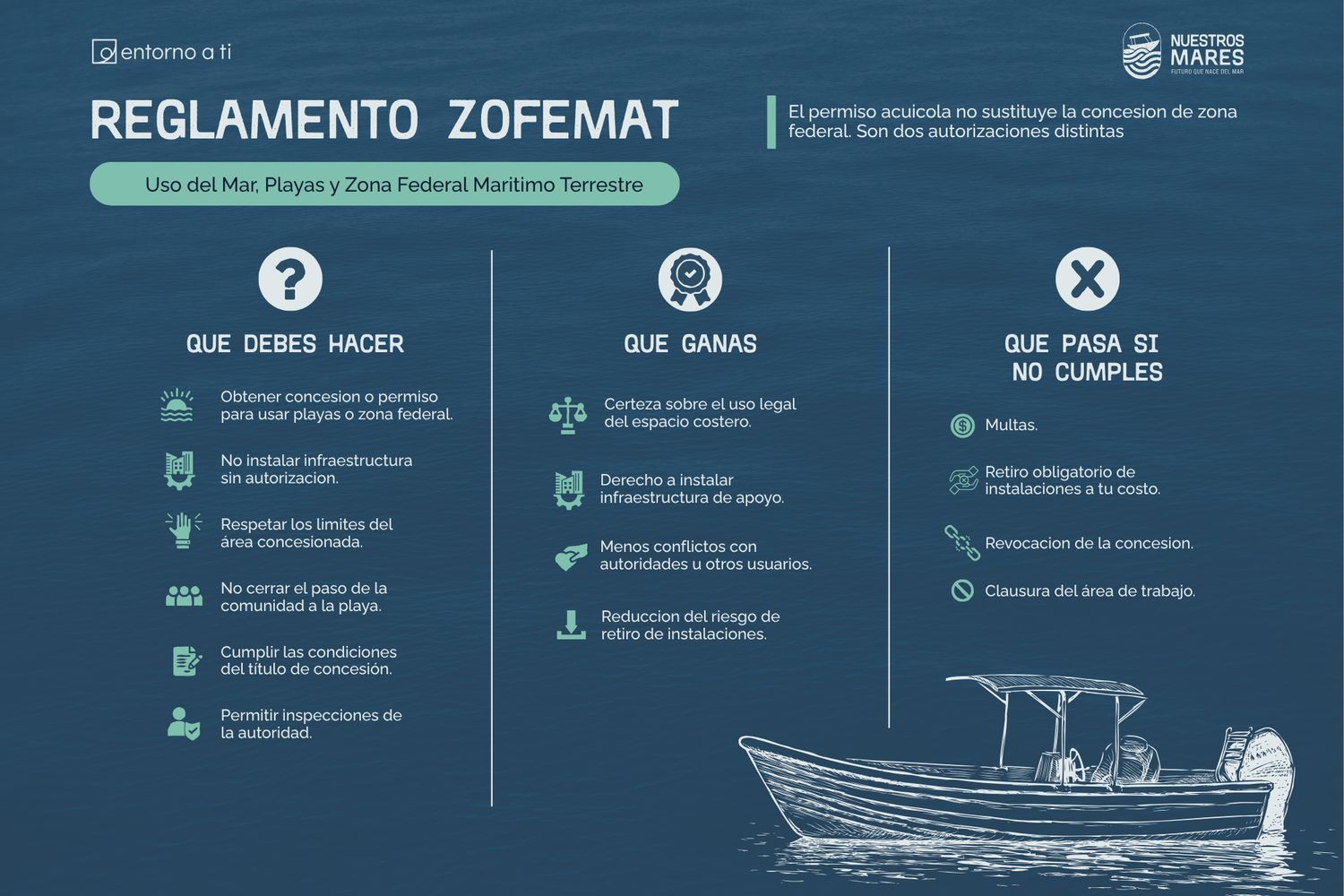
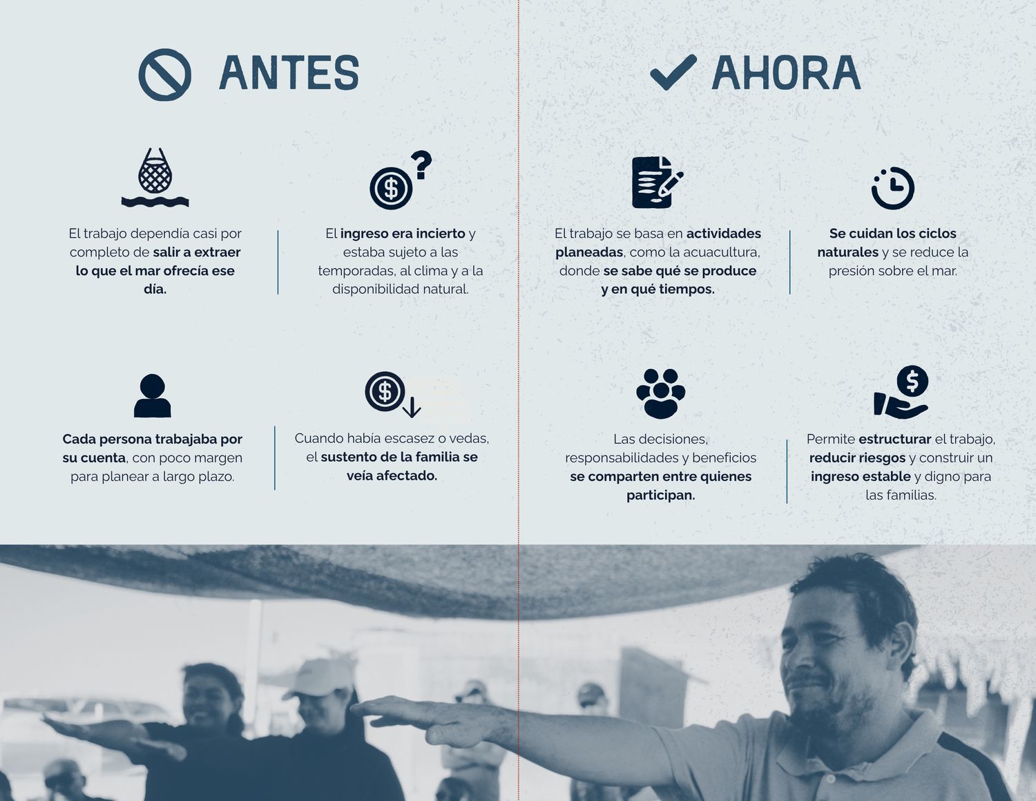
Training manuals and infographics that translate the General Law of Sustainable Fishing and Aquaculture for fishing communities.
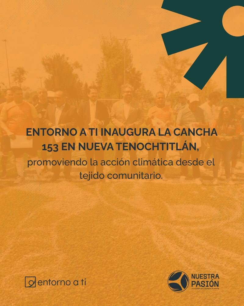
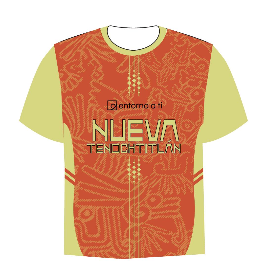
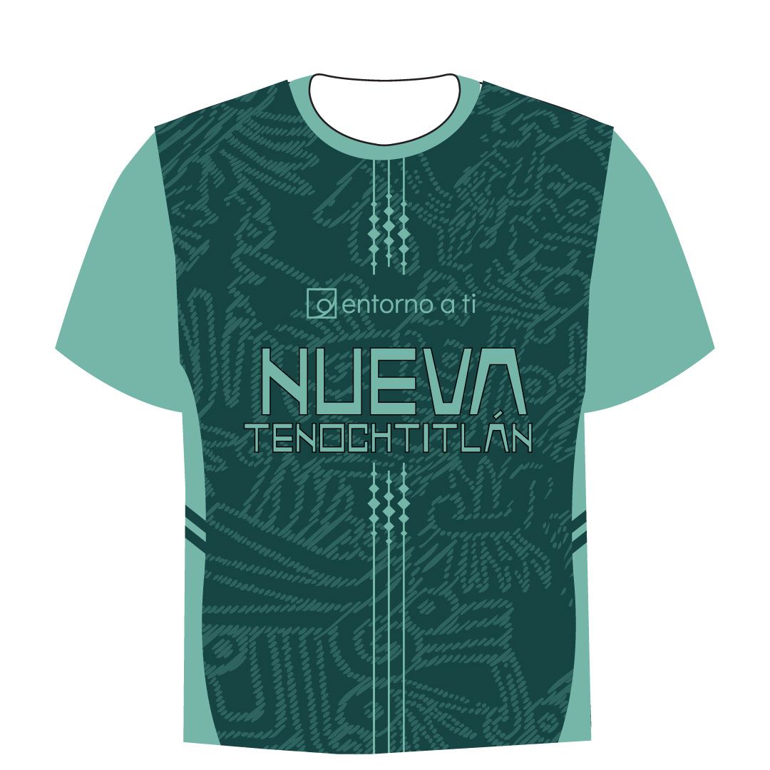
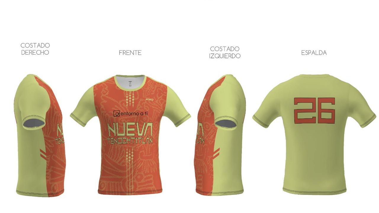
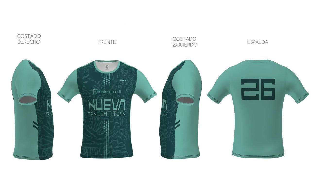
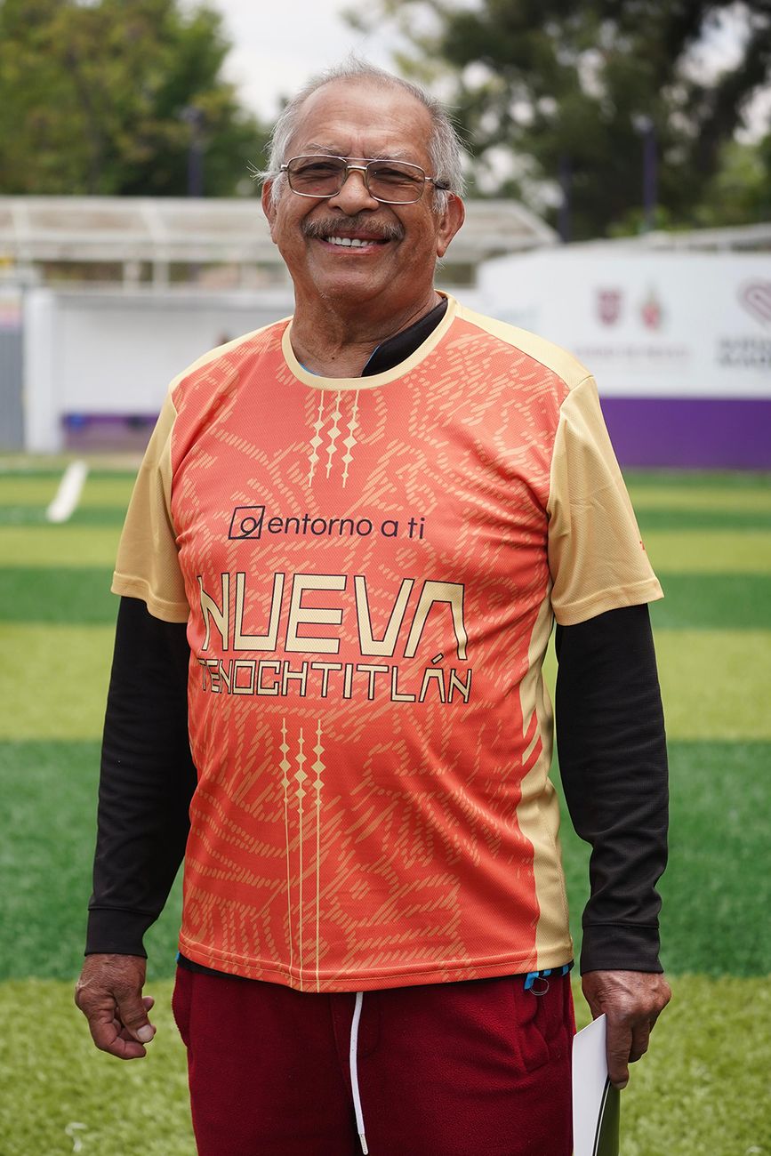
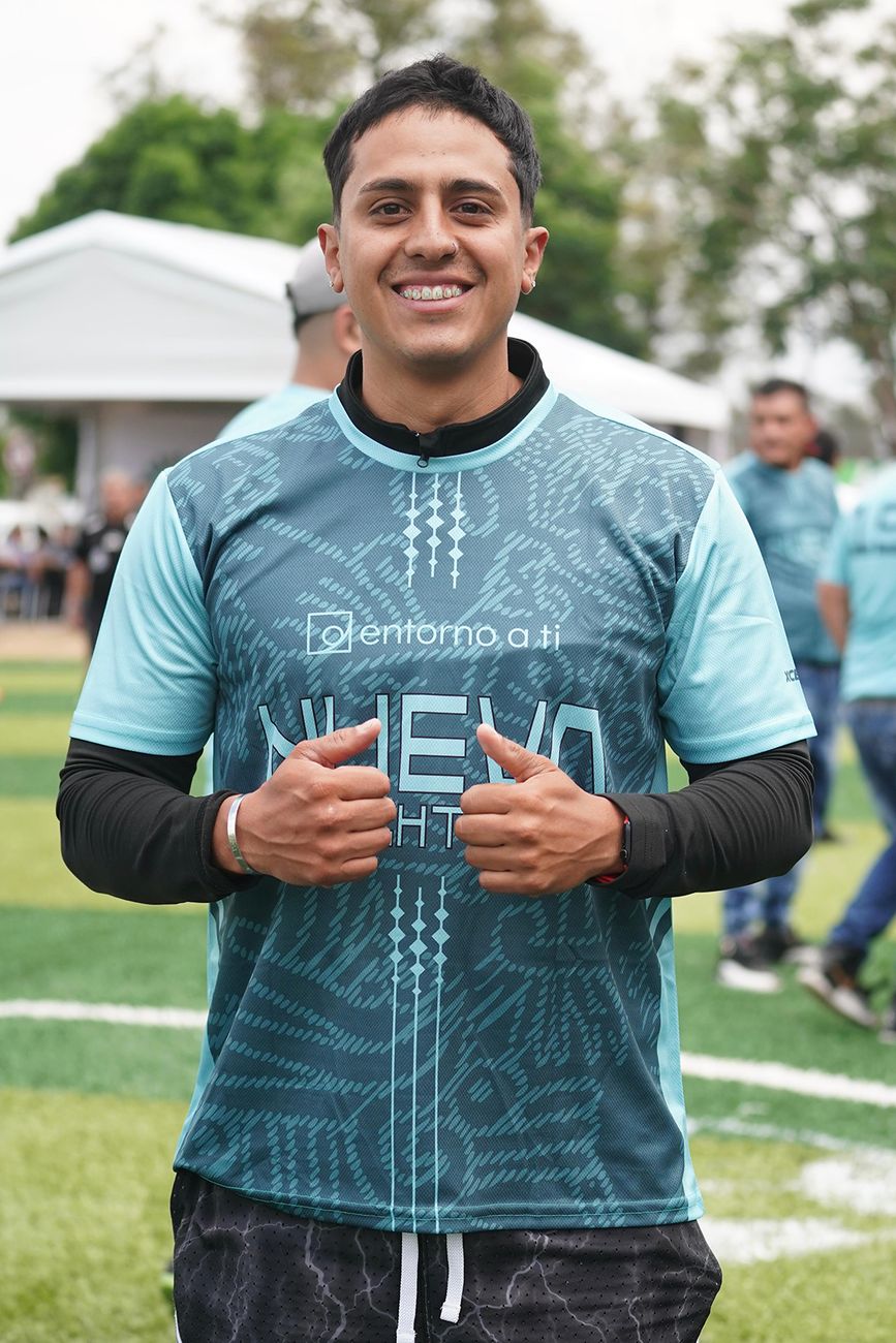
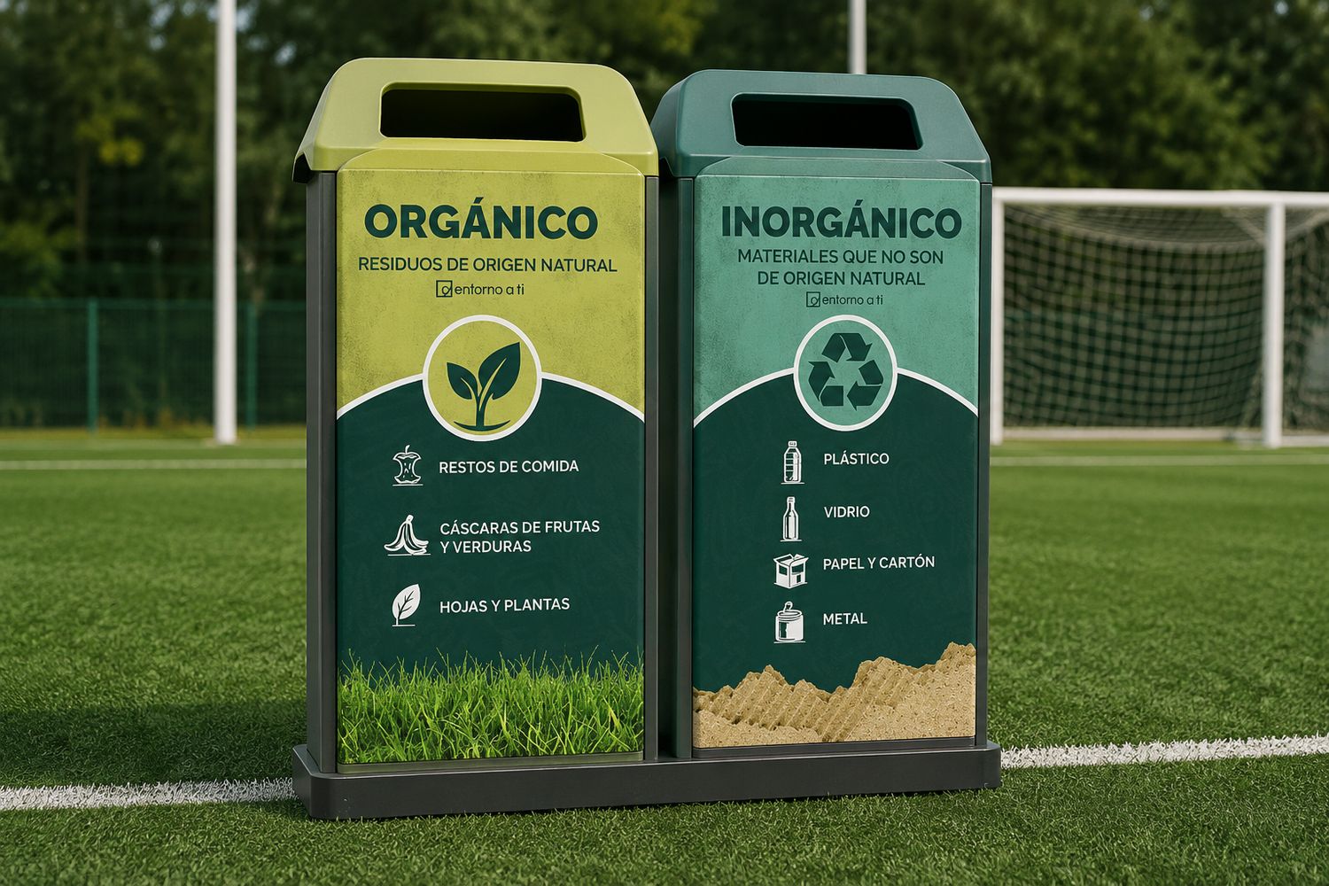
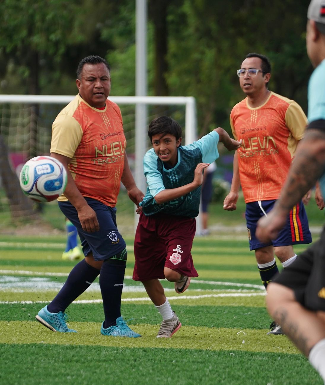
Nuestra PasiónCircular economy · Nueva Tenochtitlan
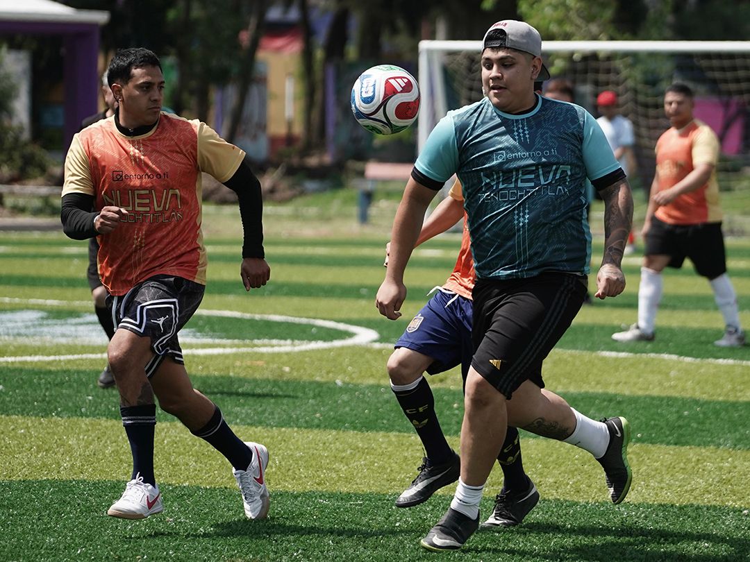
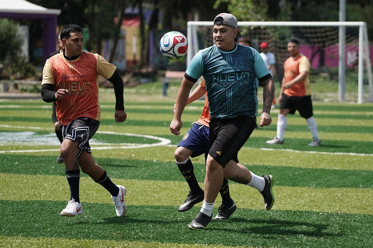
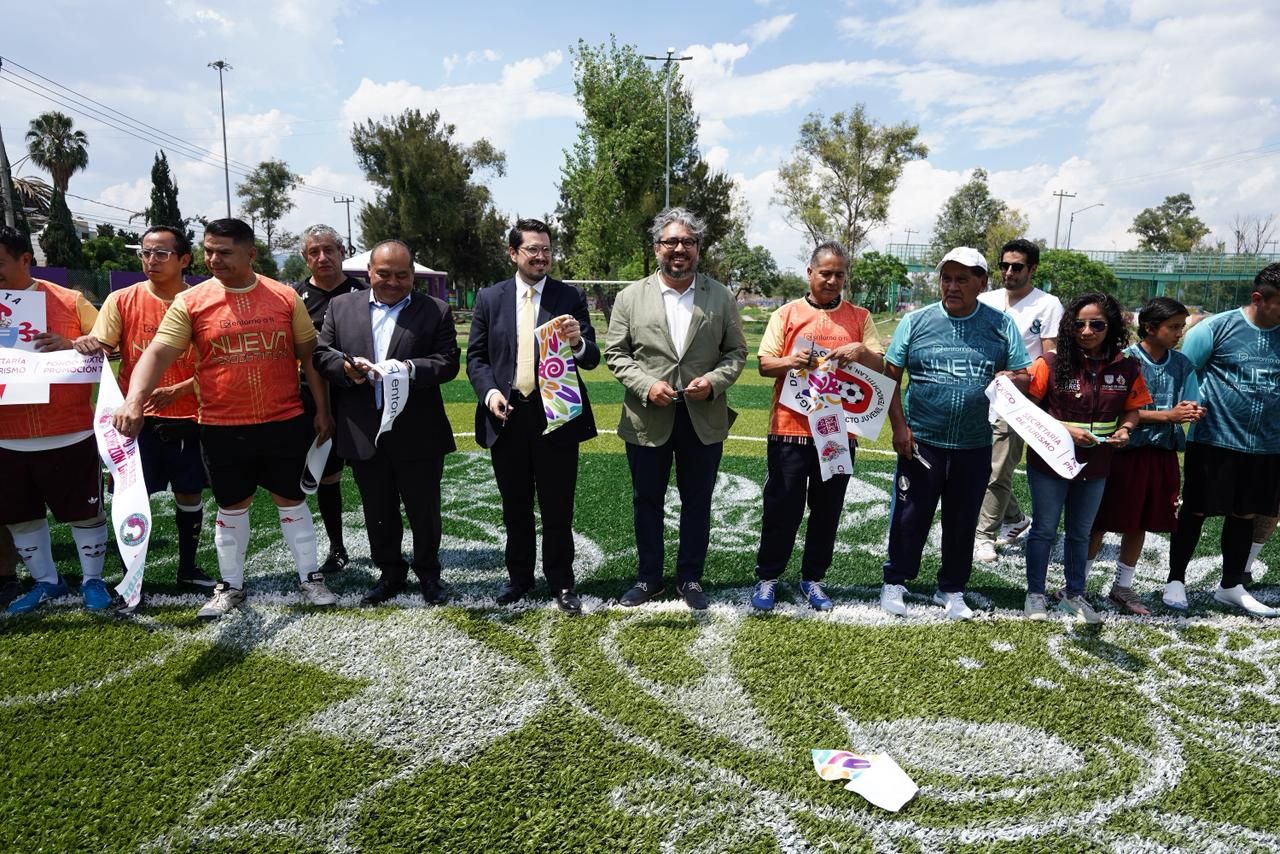
To launch the restoration of a community soccer field built to promote recycling, I designed the jerseys for the two teams that played the opening match, using the Entorno a Ti palette.
01 · Illustration
02 · 3D mockup
03 · On the field
07Art directionEvent branding
Events andinternational partners
Identities for the organization's own events and for collaborations with partners in four countries, from the invitation to the room.
Events
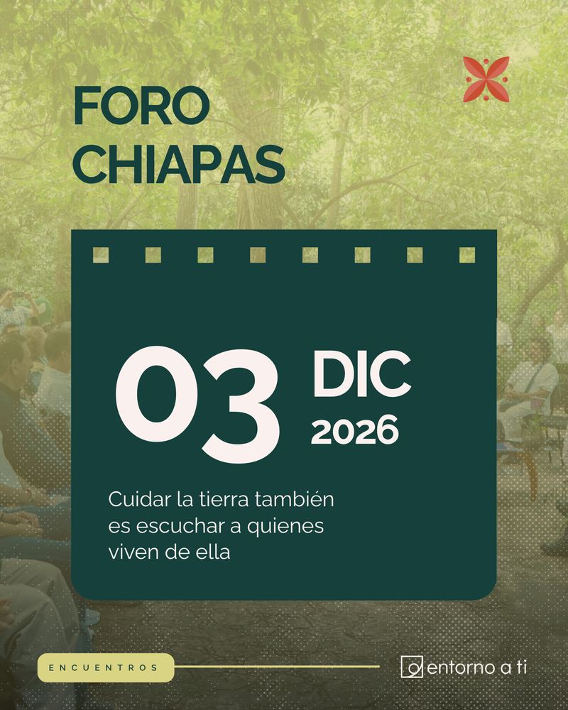
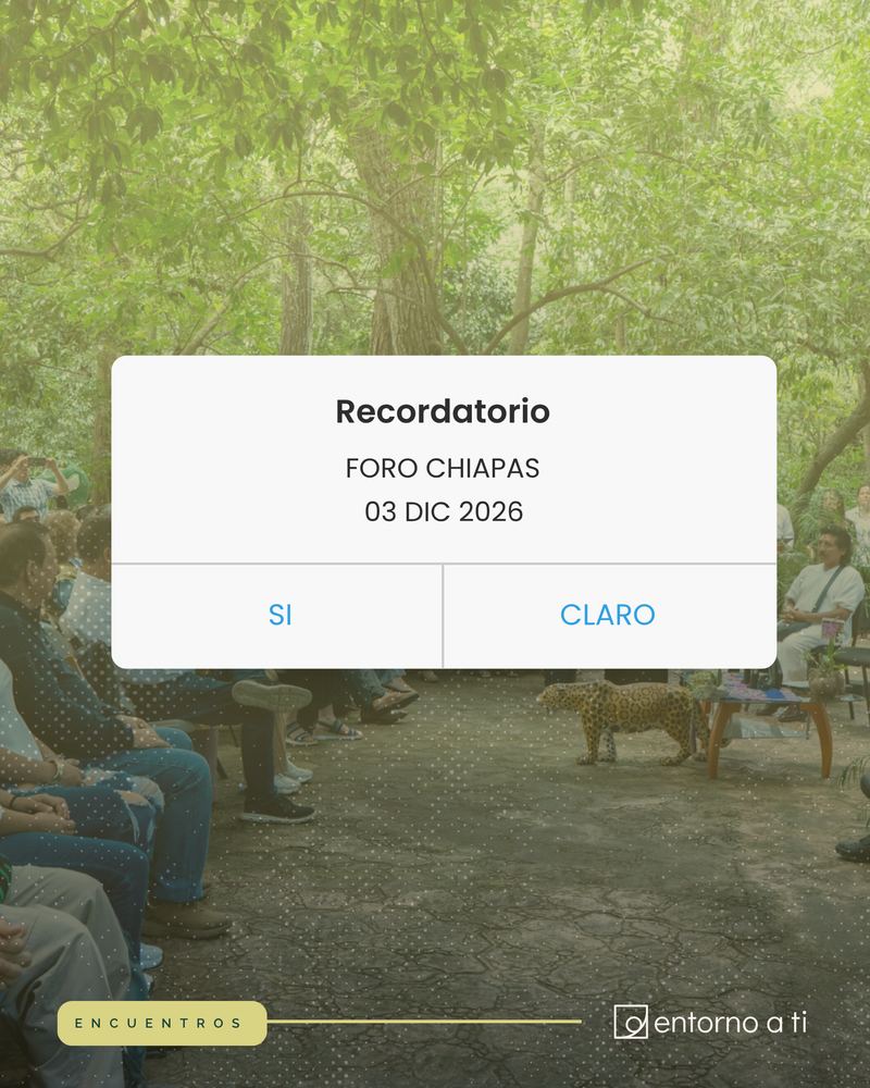
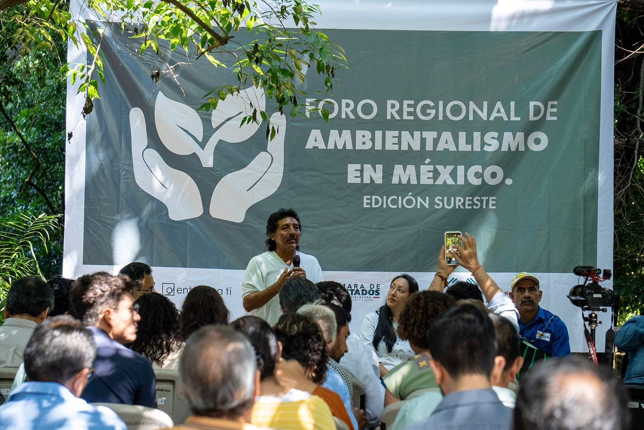
Foro Regional de AmbientalismoSoutheast edition · Mexico
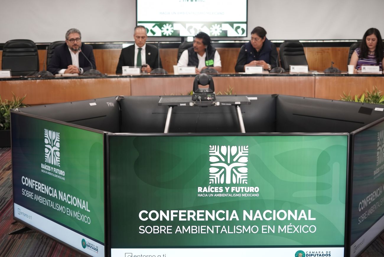
Raíces y FuturoNational conference · Mexico
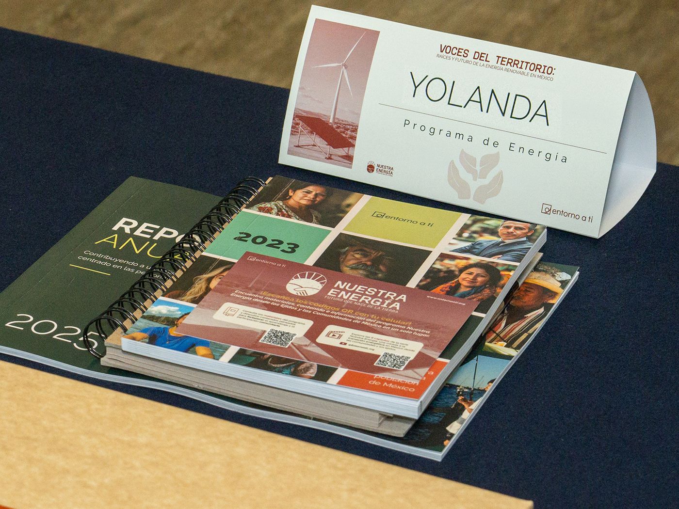
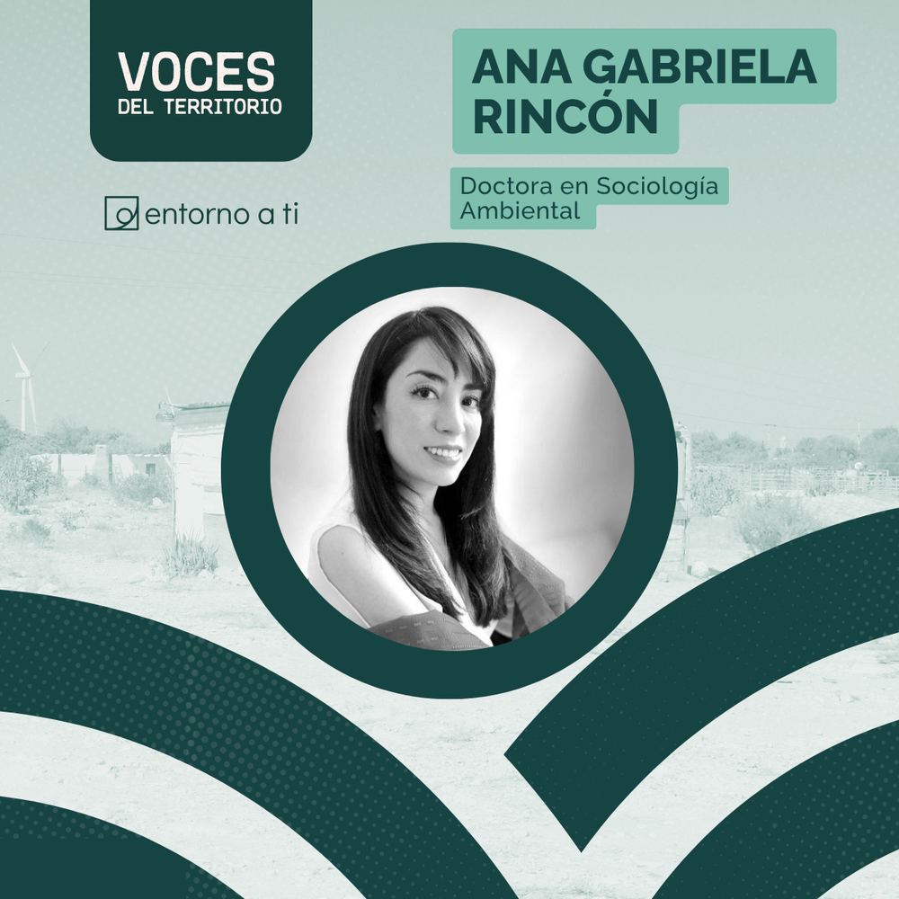
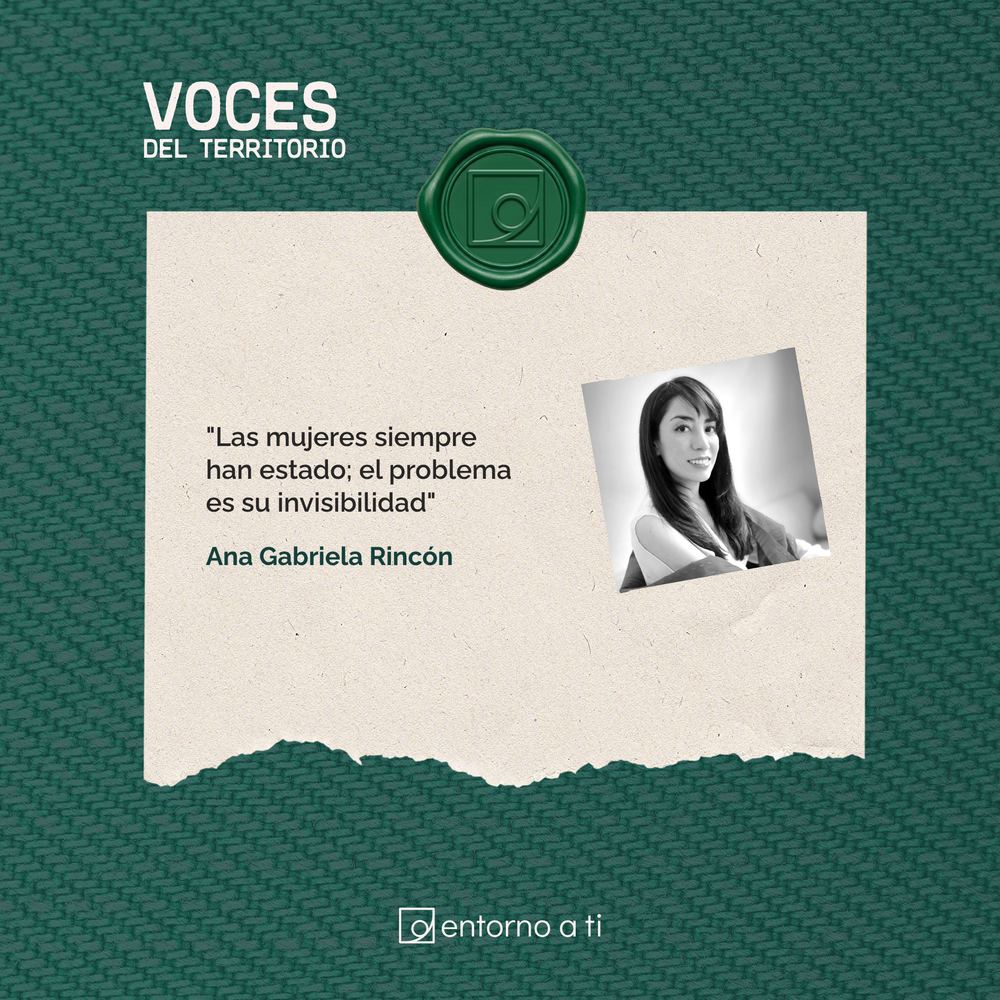
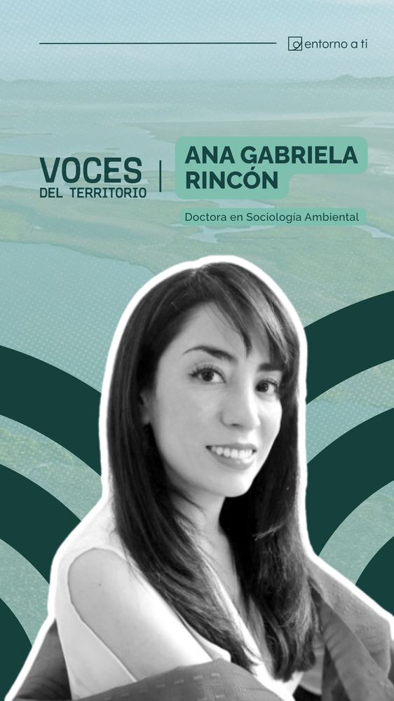
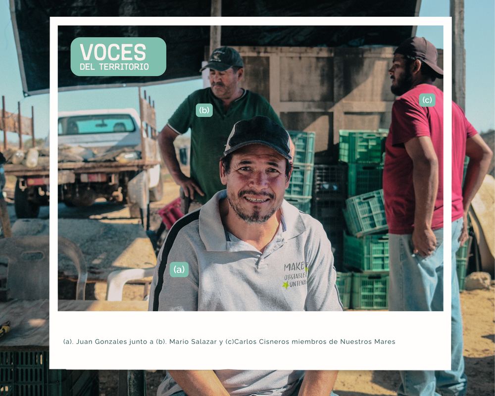
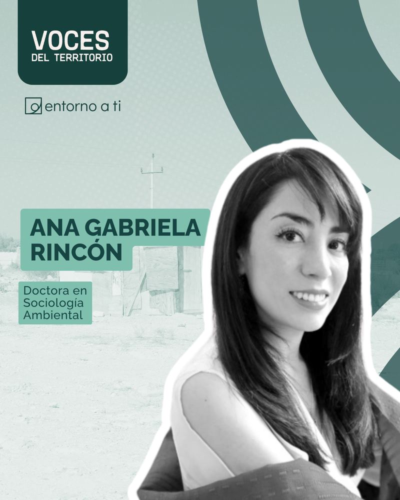
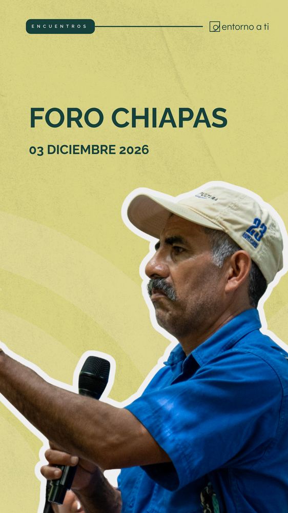
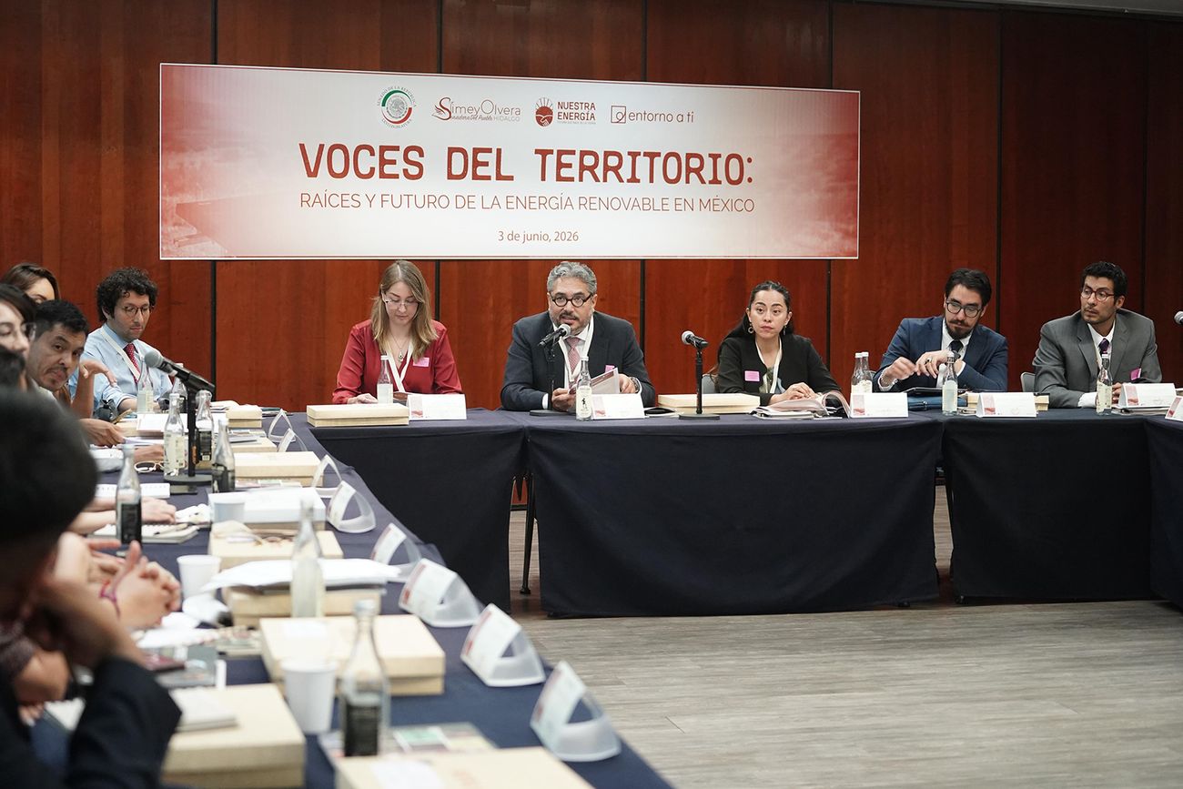
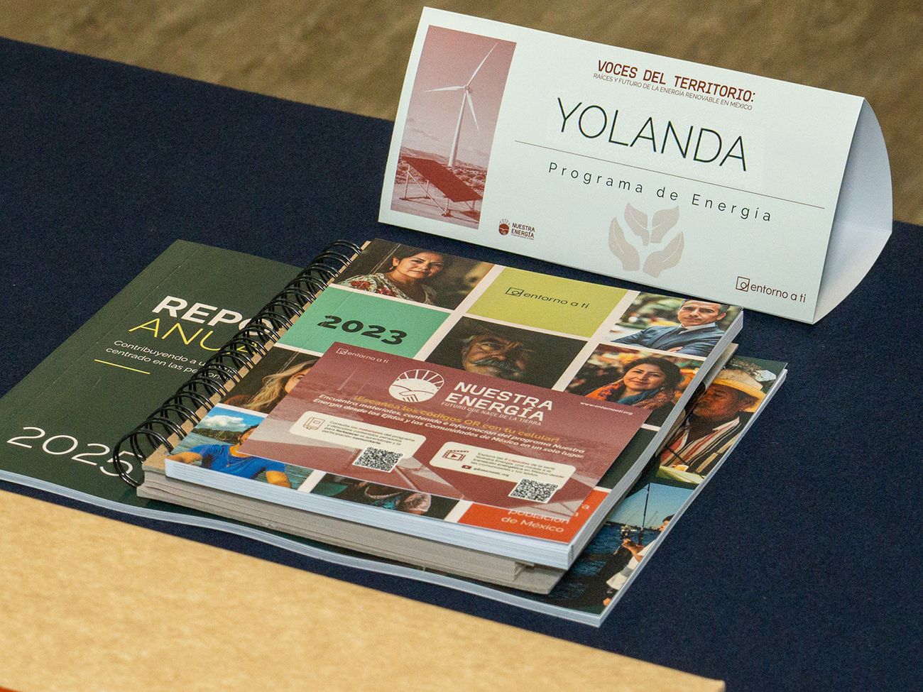
Voces del TerritorioForum · Mexico
Collaborations
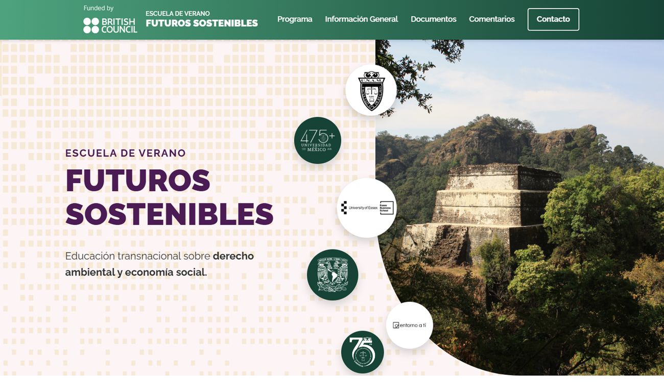
UNAM and University of EssexSummer school landing page
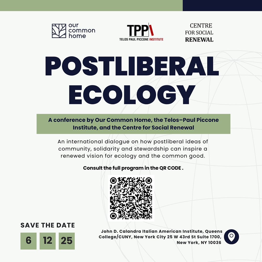
Postliberal EcologyEvent post · Switzerland
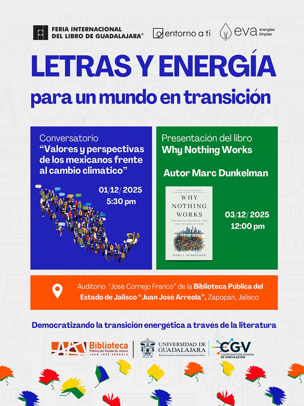
FIL GuadalajaraEvent post · Mexico
Post · coming soon
Entorno a la CreaciónBrazil
08Art direction
Designin the field
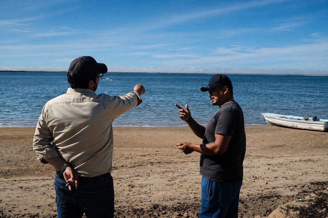
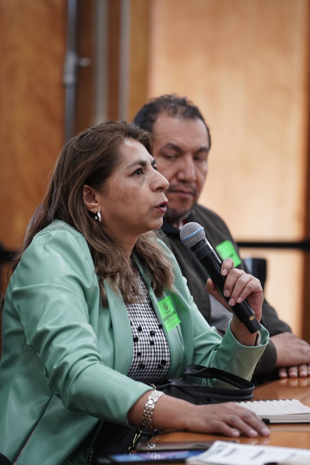
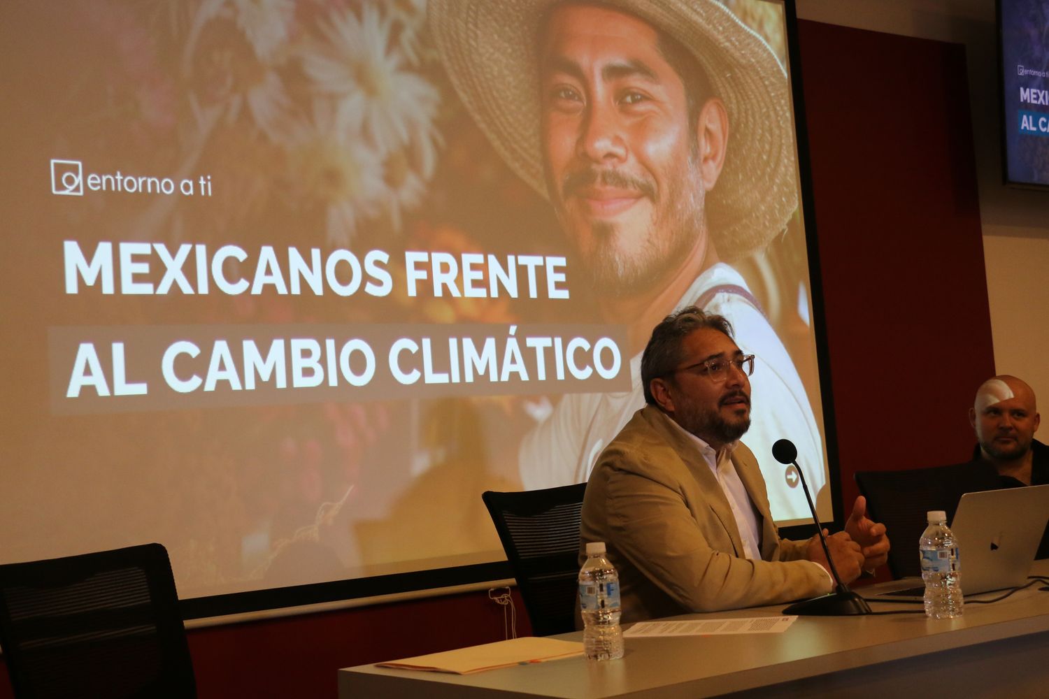
The work was made to be used. These are the materials in the hands of the people they were designed for.
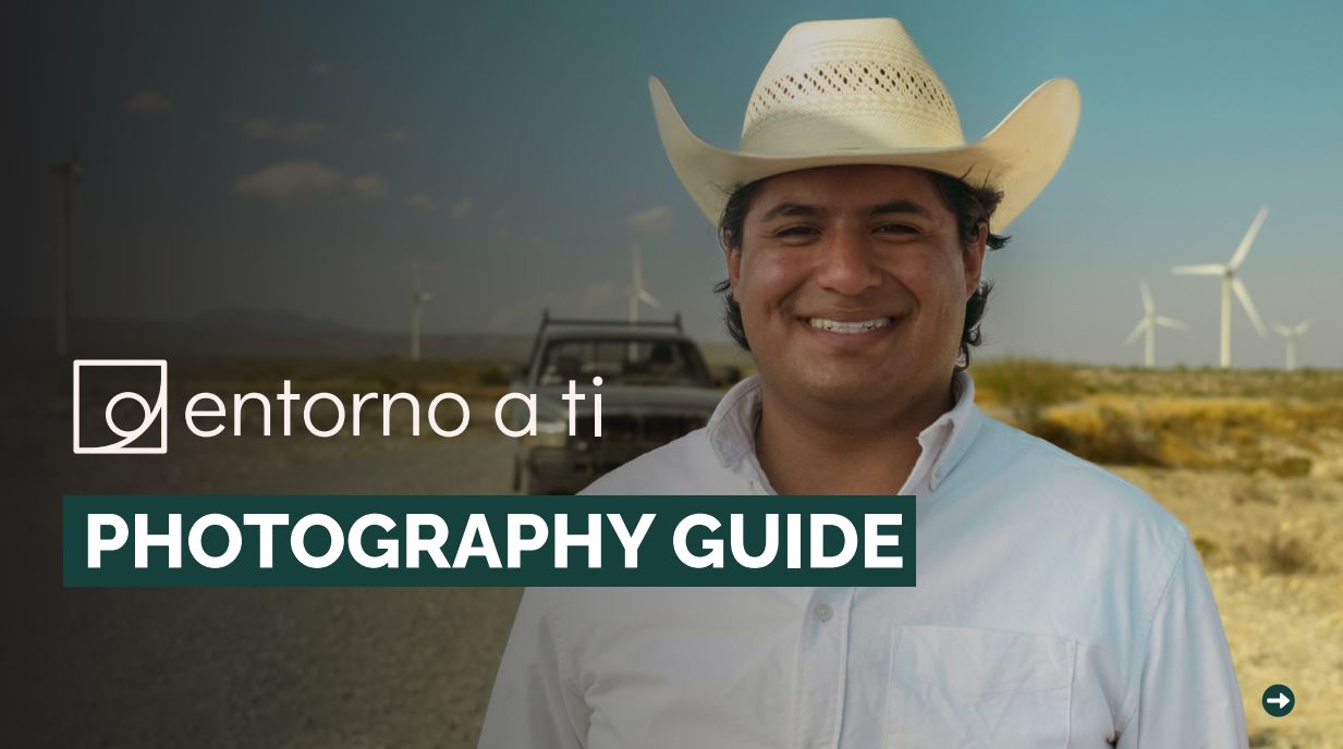
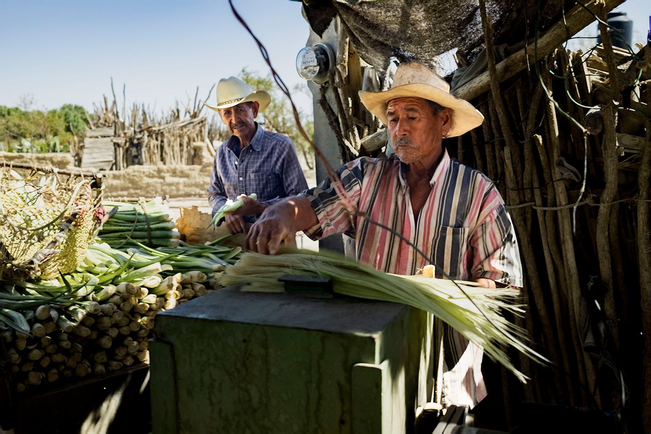
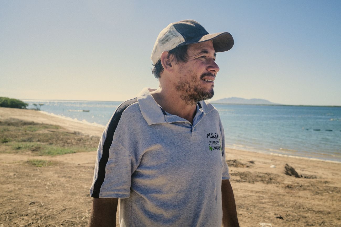
My photo direction guidelinesPhotography accompanies, dignifies and narrates.
The person is always the center. No poverty as spectacle.
Eye-level angles: horizontality as equality.
Soft natural light, real colors, no heavy filters.
Real processes, never posed “official” photos.
All credits and rights belong to the photographers of each image and to Entorno a Ti.
09Web designUX/UI
Websiteredesign
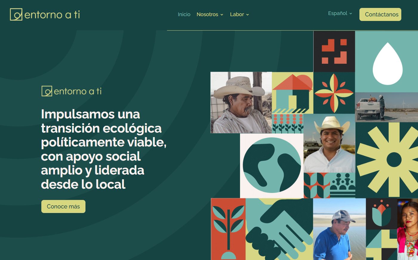
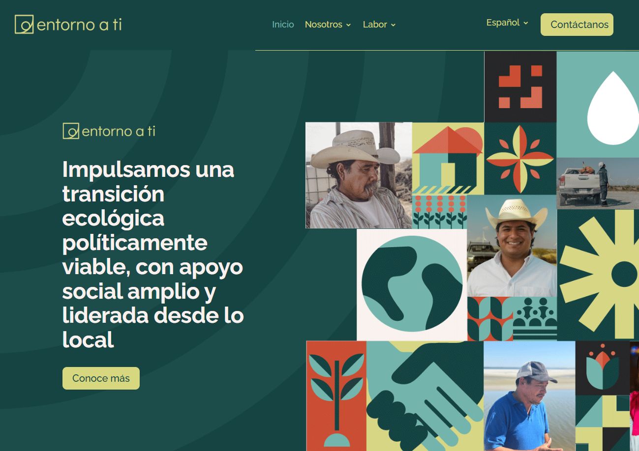
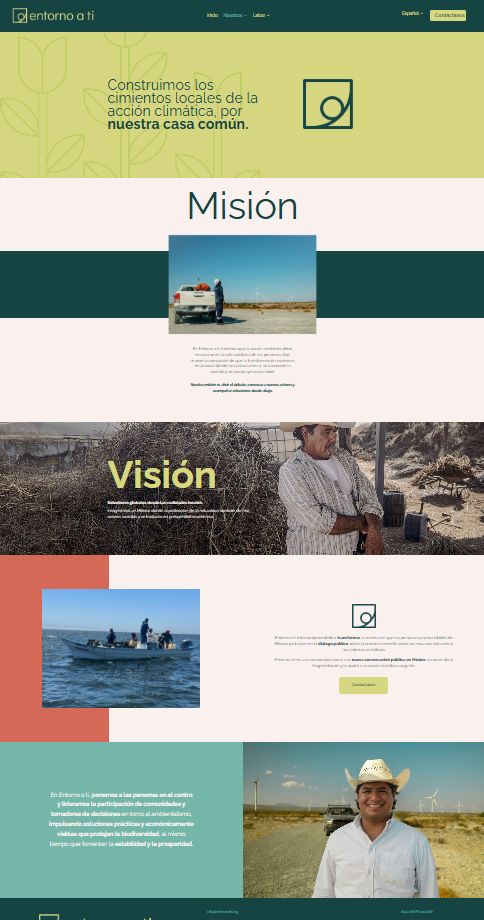
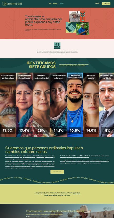
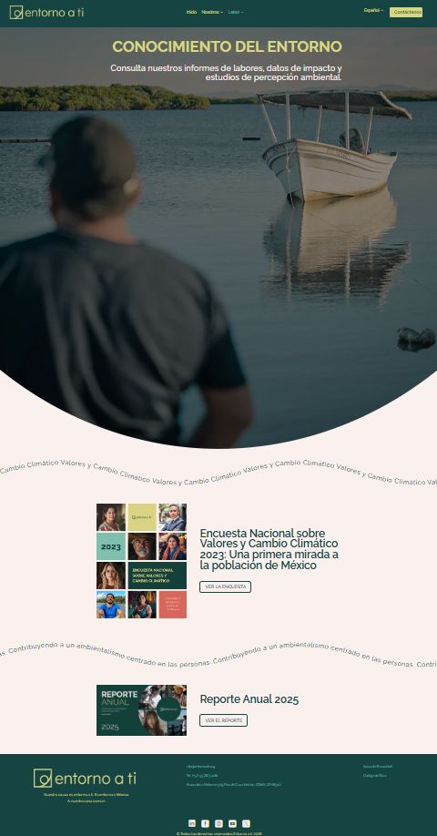
The website was redesigned around the new visual narrative: clear hierarchy for communities and institutions, documentary photography, the geometric pattern and calls to action that invite people to learn about the projects.
None of this happens without leadership and a team. I led the creative team, set the visual criteria, designed the most complex pieces myself, approved every deliverable and managed printers, suppliers and distribution so that materials reached the people and places that needed them.
Better quality from the teamOngoing direction raised the visual and conceptual level of every output.
Faster deliveryClear direction and timely reviews kept deadlines more efficiently.
Less reworkFewer last-minute corrections thanks to clear briefs and early reviews.
A more autonomous junior roleConstant mentoring strengthened their judgment and decision-making.
Supplier negotiationCost adjustments and discounts with printers, without compromising quality.
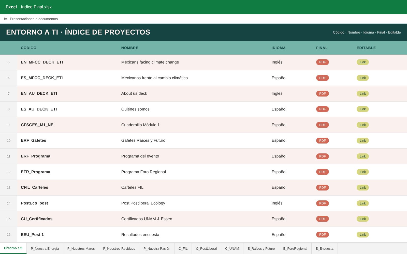
Internal tracking systemA project index with a tab per program, collaboration and event, naming codes and links to final and editable files.
More than a visual brandbook
I also wrote the Entorno a Ti brandbook as a directional tool, not only a visual one: it defines the communication tone (warm and human, empathetic, inspiring, serious but accessible), what to avoid, key words and the storytelling that every piece should follow.
11Impact
What itmade possible
Over 500 people trained across 14 municipalities in southeast Coahuila and 4 Mexican states, a family of 5 program brands, and partner work in Switzerland, Brazil and the United States.
Q1Who is it for?Q2What do they need to understand?Q3What visual language builds closeness without losing credibility?
Credits
Thank you
Creative directionAlejandra Leal
Design teamAlejandra Leal, Daniela Romero, Oscar Franco
Photography credits belong to each photographer. All rights to the work belong to Entorno a Ti — Our Common Home.